-
12 Map Happenings that Rocked our World: Part 9
A Curious Phenomenon Called ‘Etak’
Every once in a while, a revolutionary product comes along that changes everything. Or so said Steve Jobs when he announced iPhone in 2007.
But I’m talking about a different revolutionary product. A foundational product that forever changed how everyone on this planet gets to where they need to be.
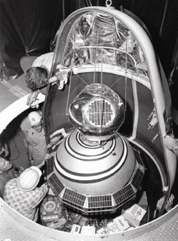
Today, I’d like to tell you about the Etak Navigator, a truly revolutionary product and the world’s first practical vehicle navigation system.
Here’s a picture of it:
At the time, it was considered out-of-this-world. This is what Silicon Valley’s San Jose Mercury News said about it:

The Etak Navigator launched 39 years (!) ago in 1985. 😱

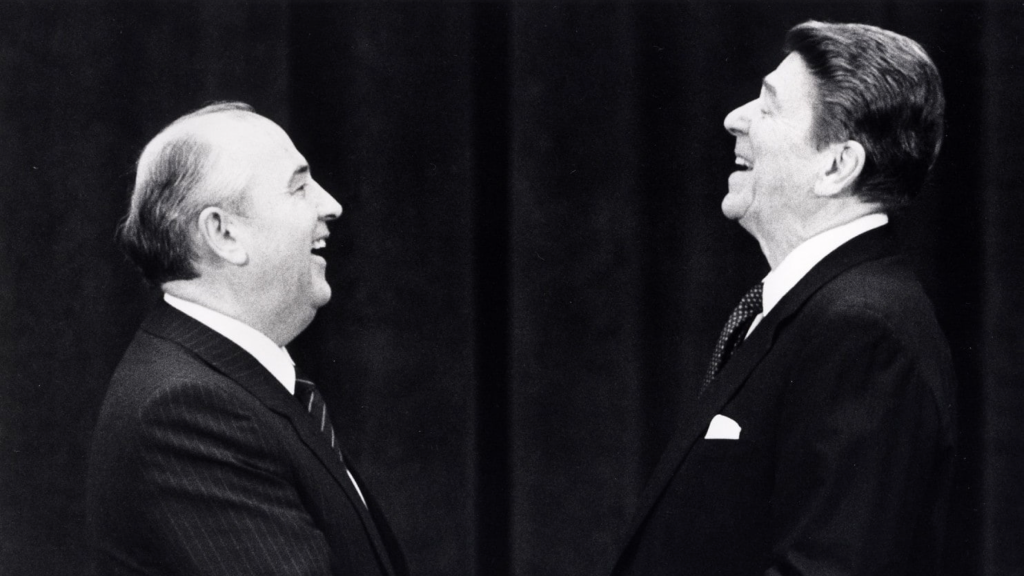
Back then Reagan and Gorbachev were negotiating the end of the cold war.
And it was the year Steven Spielberg released the film “Back to the Future”…

Credit: Steven Spielberg, Robert Zemeckis and Universal Pictures And I’m sure at that time many of you were but a twinkle in your mother’s eye…

Back in 1985 you used paper maps to navigate, like this one from a Thomas Brother’s map of Los Angeles:
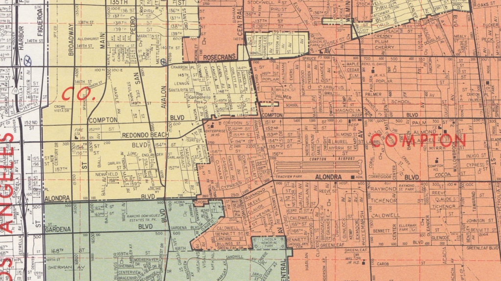
As you can see, the maps weren’t always pretty. By today’s standards it was also supremely difficult and tedious to find locations and even more difficult to work out how to get there.
So, when the Etak Navigator launched, it was like something from the future.
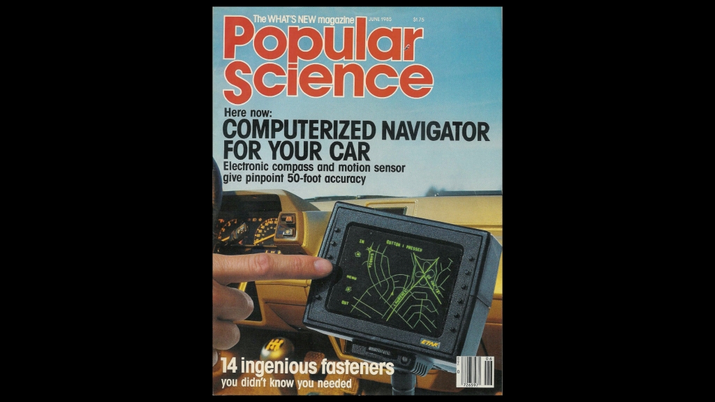
It immediately got tons of press, including the front cover of Popular Science:
Nearly everything about the Etak Navigator had to be conceived from scratch.
Most important was the self contained positioning system. Remember that back in 1985 GPS was not available (see “12 Map Happenings that Rocked our World: Part 8 — Oh Brother, Where Art Thou?“)
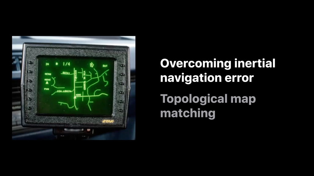
Before GPS, navigation systems used a technique called ‘dead reckoning‘. Dead reckoning relied on sensors to determine distance traveled and direction of travel. However, no sensor is perfect. As a result the further you travel the greater the errors build. Pretty quickly you have no idea where you are.
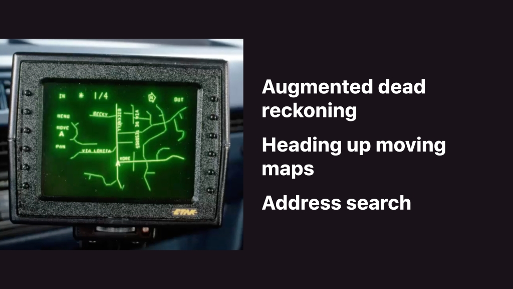
To solve this problem Etak invented ‘augmented dead reckoning’. This used a process to match the position given by the navigation sensors to a topologically correct electronic map. Whenever the vehicle turned you made the assumption that you’re driving on a road. At that point the location could be ‘snapped’ back to the road and the error from the sensors could be reset. This technique was later adopted by all navigation apps and is still in use today.
Like all attempts at building a navigation system before it, without this key invention the Etak Navigator would have failed.
The second key invention was a ‘heading up’, moving map display. This meant that the vehicle remained at the center of the screen and the map moved and turned under the vehicle. What you saw ahead of you in the windshield was what was displayed on the screen. This proved highly intuitive.
Third: the Etak Navigator was also the first consumer device to introduce the concept of address search, or what the geospatial industry has come to call ‘geocoding’.
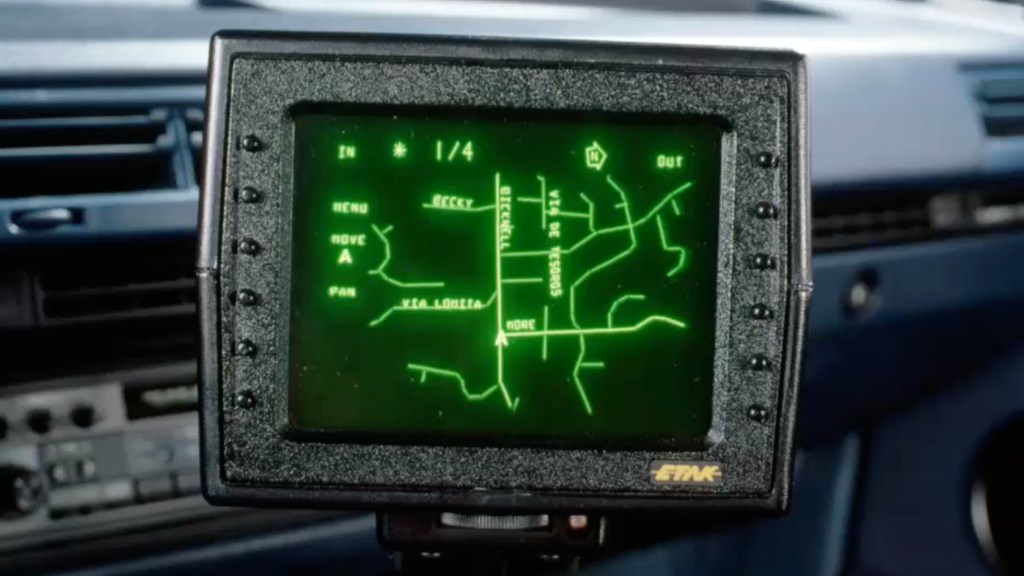
Here is a clip from the only video I could find of the Etak Navigator in action:
As you can see the map moves and turns as the vehicle drives.
The buttons on the right control the zoom level which is denoted as the number of miles between the vehicle symbol and the top of the screen.
The top of the screen shows the current zoom level, the heading to the destination, the number of miles to the destination as the crow flies, and which way is north.
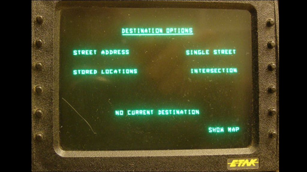
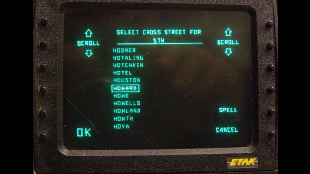
The address search allowed entry of destination by address, street or intersection. You could also store common locations like home and work.
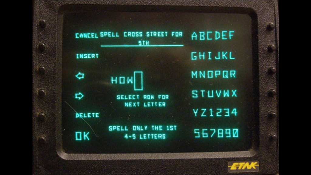
The Etak Navigator had twelve buttons, six on each side of the screen.
These were soft programmed depending on the current function.
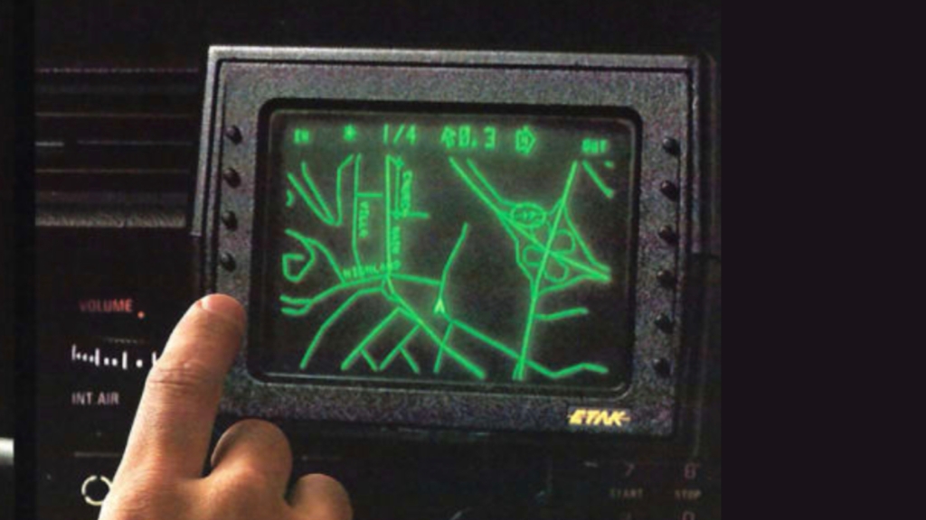
In the screen below you can see how street names were entered. Note how any letter or digit could easily be entered with just two button pushes. Also, you only had to enter the first few letters of a street name:
And after that you simply selected the street from a list:
This is the Etak Navigator in navigation mode:
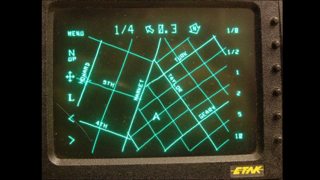
Note that the Etak Navigator did not provide turn-by-turn directions. Instead you simply zoomed out the map to see your destination, shown as a flashing star. As you got closer to the destination you zoomed in revealing more of the local roads. You had to use your own noggin to determine the most appropriate road to take.
The lack of turn-by-turn navigation did not prove to be an issue. I know from much personal experience that the system worked very well!
Etak Navigator System Details
There were five key components to the Etak Navigator:
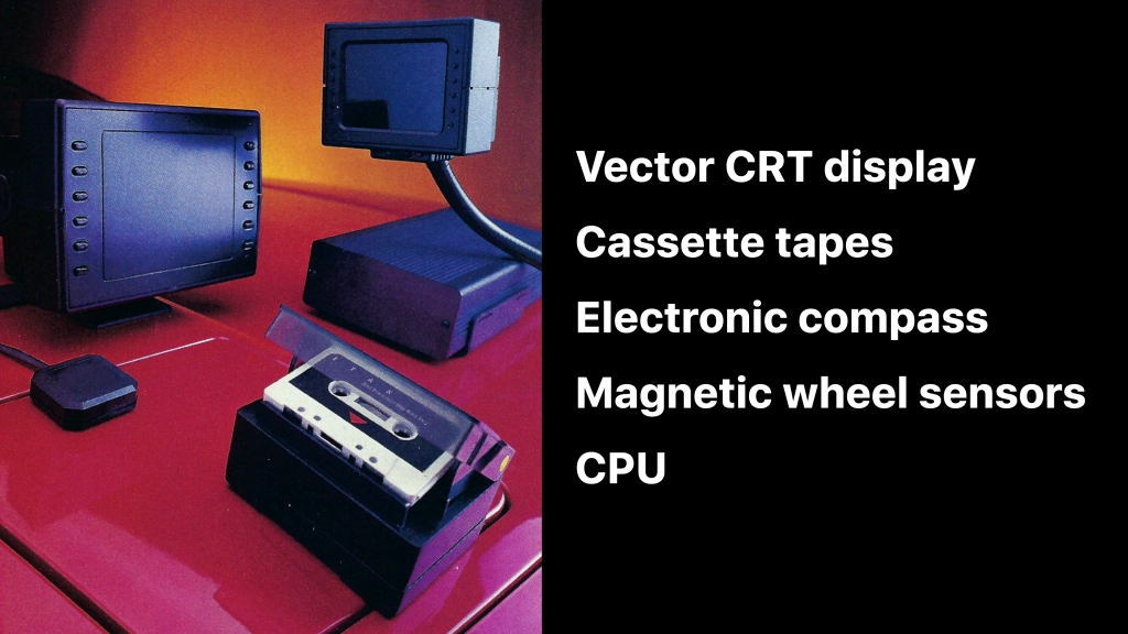
The first was a vector CRT display — similar to what you might find in an oscilloscope.
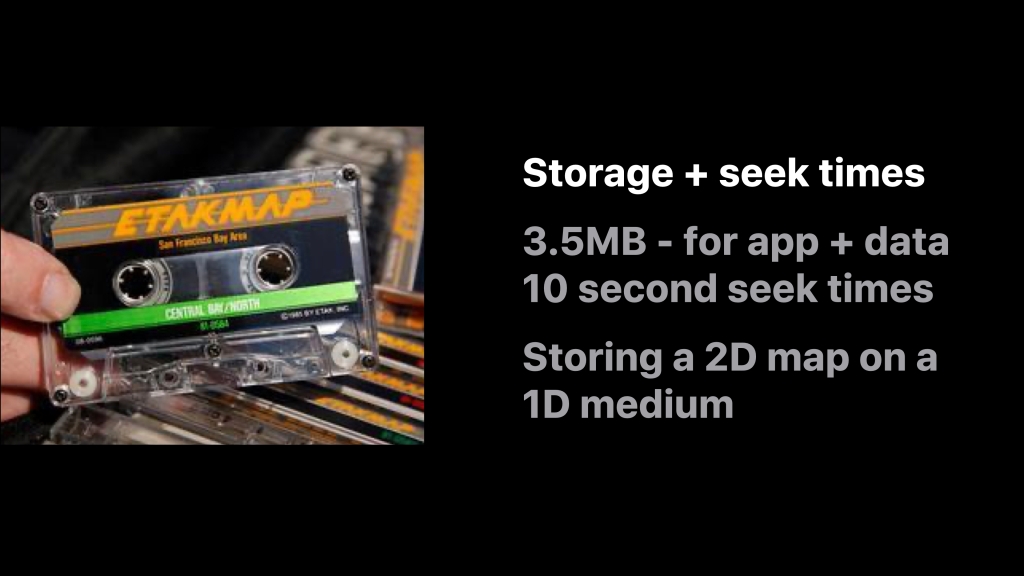
The navigation app and data were stored on cassette tape. The cassette tape drive was specially developed to read the tape at very high speed. In a music player a cassette tape is read at about 5cm (1 and 7/8″) per second. The cassette tape in an Etak Navigator was read at about 200cm (80″) per second!
There was an electronic compass installed on rear window of the vehicle.
To determine distance traveled and to augment the heading info from the compass, magnetic wheel sensors were installed on the un-driven wheels of the vehicle. This involved sticking special magnetic tape on the inside of the wheels and mounting magnetic sensors on the brake calipers.
Finally there was metal box about the size of a shoe box that contained the CPU and motherboard. This was installed in the trunk.
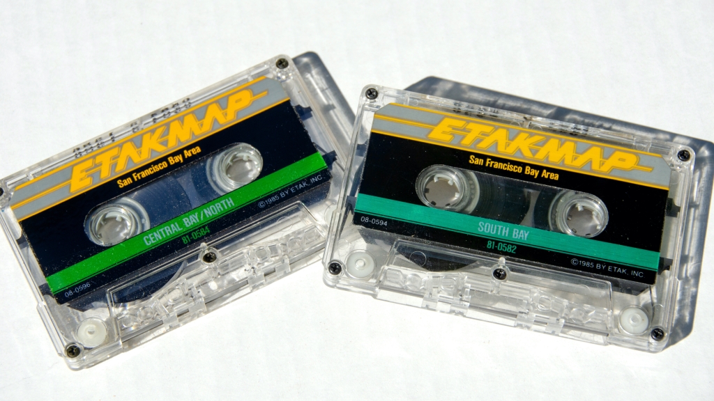
The cassette tapes stored both the navigation app and the map data. The maps were called “Etak Maps”. It took 6 tapes to cover the San Francisco Bay Area:
The original price for the Etak Navigator was US$1,395:

That’s the equivalent of about US$4,000 today.
On top of the cost of the Navigator there was an expensive installation cost: it took an experienced technician about 4 hours to install the whole system.
Just Some of the Technical Hurdles
Back in 1985 there were huge technical constraints.
GPS barely existed. In those days the government prevented anyone but the military getting more than 100 meter accuracy. And GPS receivers were both large and expensive.
In addition there were no large capacity interchangeable media. Floppy disks couldn’t store enough information and CD-ROM technology was brand new and too costly.
The most important problem to solve was overcoming inertial navigation error from the wheel sensors and the compass.
Here the solution was topological map matching.
This invention, above all others, made the product viable.
Another issue was data storage and latency.
The cassette tapes only held 3.5 megabytes and had 10 second average seek times.
The dev team had to invent a way of storing the 2D map on a one dimensional medium, making sure that regions close by on the map were also close by on the tape.
Years later, when hard drives became cheaper and CD-ROMs became more readily available Etak’s highly efficient map data storage algorithm paid off in spades and resulted in very high performance maps.
Another problem was heat.
Users commonly left tapes on their dashboards and obviously dashboards can get very, very hot.
You can see from the tests that not all brands of cassette tape did very well:

However, a brand that worked was finally found. It had a shell made of polycarbonate.
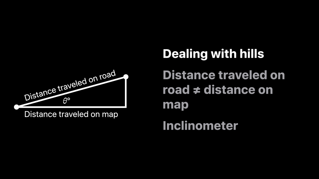
Yet another problem was dealing with inclines.
The map had no elevation information and so if you were traveling up or down a hill errors would be compounded in the system as the distance traveled on the road was not equal to the distance traveled on the map.
To compensate we therefore needed to know the slope of the hill. To compute this Etak’s lead hardware engineer invented a special inclinometer that used fluid and a capacitive sensor. In tests on various fluids he found that Tequila worked quite well!
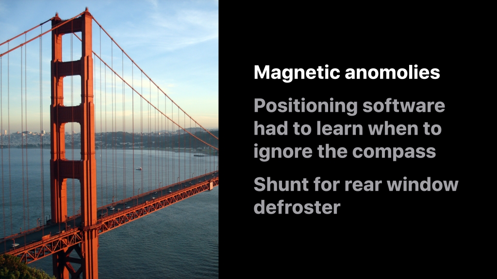
Another problem were magnetic anomalies.
Bridges can be highly magnetic and can really throw off a compass.
The positioning algorithm therefore had to recognize these anomalies. When an anomaly was detected the positioning instead relied on the different speeds of the wheels to determine changes in direction. It wasn’t quite machine learning, but at the time it seemed pretty close!
The system also had to compensate for the magnetic fields generated by the rear window defroster.
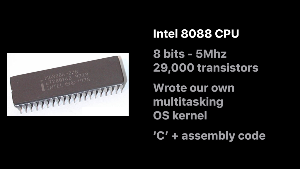
In 1985 there wasn’t the luxury of 25 billion transistors and an M3 chip.
Instead the system relied on an Intel 8088 CPU which had 8-bits, ran at 5MHz and only had 29,000 transistors.
Thus every line of code had to be incredibly efficient. It was all written in C, except for key parts of the OS kernel which were written in assembly.
What about the digital map?
Etak had to create it — more or less from scratch.
Originally Etak thought it could get maps from the government. Back then the US Census Bureau had something called GBF DIME files (which predated TIGER). But they were stick maps and didn’t contain any shape to the roads.
Etak therefore embarked on a massive program to build a map of key metropolitan areas across the US and later in Europe.
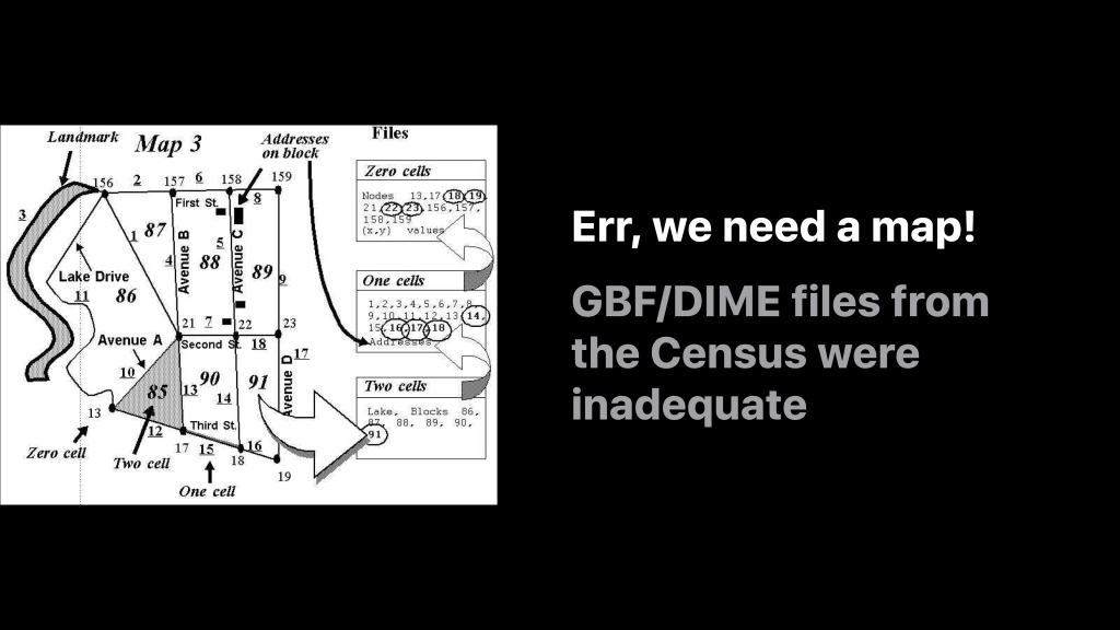
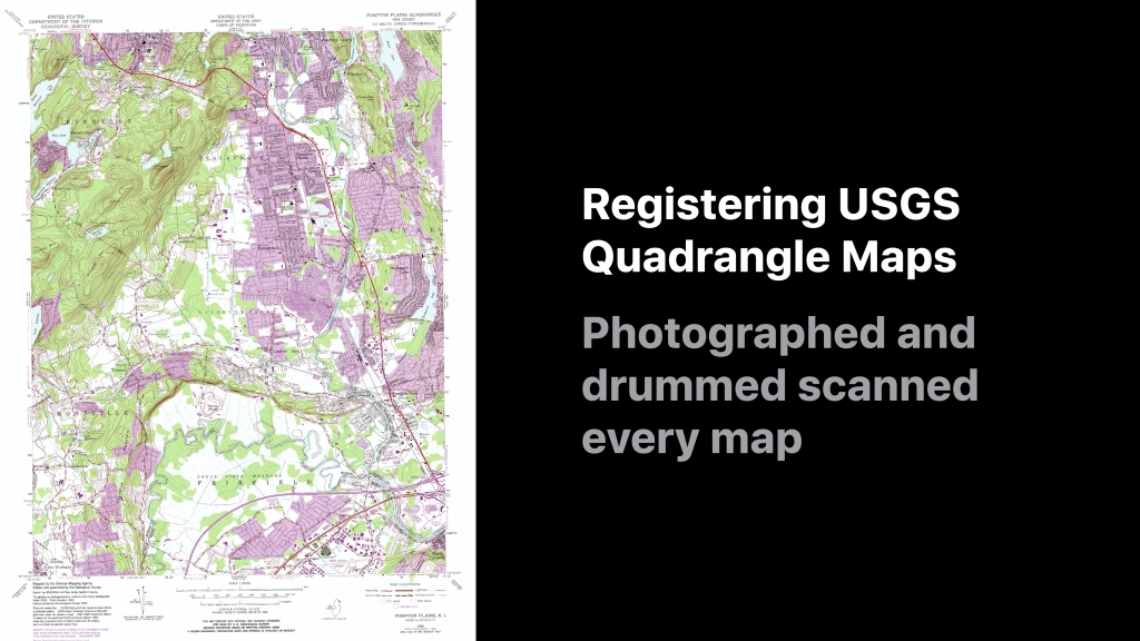
To reposition the GBF/DIME files and give them some shape we used 1:24,000 scale United States Geological Survey quadrangle maps, otherwise knowns as ‘USGS quads’ as a reference.
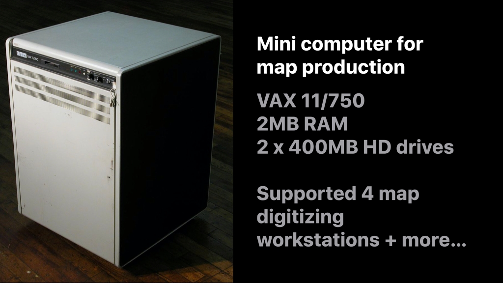
Each map was photographed onto 10” transparencies and then scanned using a very expensive drum scanner.
The entire map production program was developed and ran on a single VAX minicomputer. This blazing machine had 2MB RAM and two 400MB hard drives. It cost about US$120,000 in today’s dollars.
This little devil was burdened with a mammoth set of tasks. It supported:
- 4 map digitizing workstations
- The engineers developing and compiling code
- Batch jobs to process and compile all the map data
- The company admins who used it for word processing
This was the coding environment:
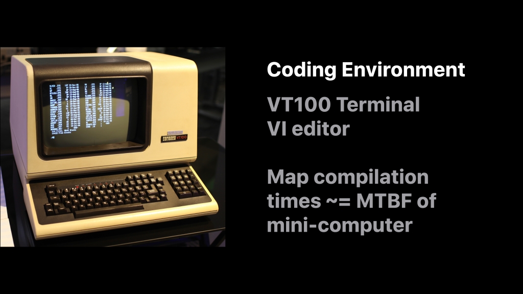
A dumb monochrome terminal.
You edited code using the ‘vi’ editor. Sometimes you waited an hour for your programs to compile.
The jobs to process the map data took up to two weeks to run … which was longer the the mean time between failure for the VAX mini-computer. The engineers used to joke that they should run the long jobs only immediately after a hardware failure had been fixed (knowing full well they were uttering a statistical fallacy).
The map digitizing environment was also revolutionary:
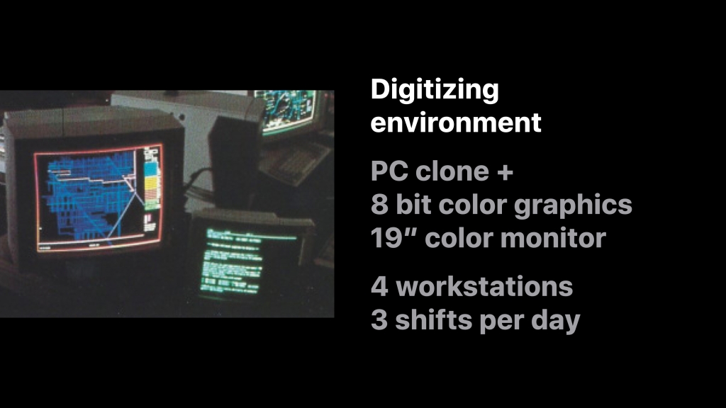
Each digitizing workstation was comprised of a PC clone with an 8-bit color graphics card and a 19” monitor. Initially there were four workstations which were manned by three shifts a day. Later this grew to 36 workstations. Etak digitized maps 24 hours a day, 5 days a week and 8 hours a day on weekends.
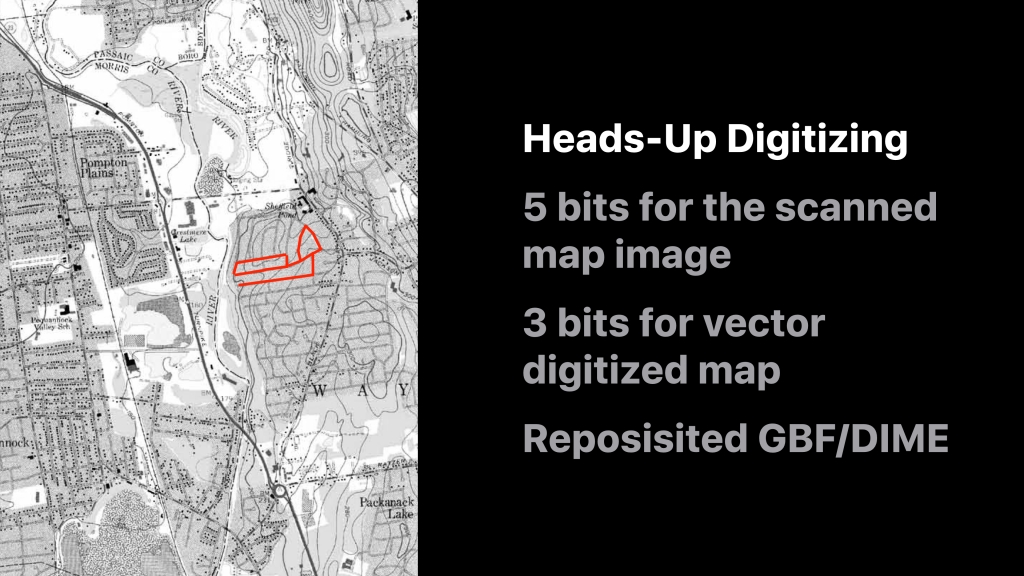
The map editing system was the first ever to use ‘heads up’ digitizing and was a huge trade secret at the time. It was so secret that the methodology was never patented and the digitizing environment was walled off from prying eyes — especially from the CEO of a particular company called ‘Environmental Systems Research Institute‘ — i.e. a gentleman called Jack Dangermond who I’m sure would have leapt at the chance to borrow the concept. 😉
Before this invention people used to digitize ‘blind’ using digitizing tablets which was highly inefficient and error prone.
Etak’s map production system leveraged the eight bits of the color graphics card very efficiently. 5 bits were used to display the scan of the USGS quad in greyscale and the other 3 bits were used to display the digitized map on top. The system was used to reposition the GBF/DIME files as well as to digitize new roads and edit road attributes like street names and addresses:
The Amazing Team Behind It
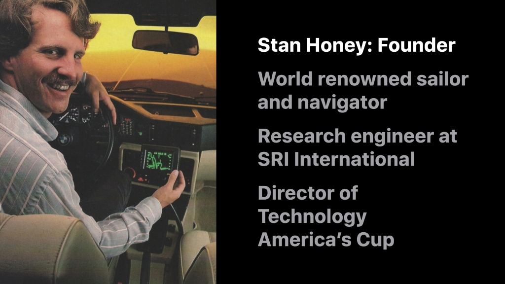
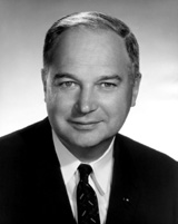
Etak was founded in 1983 by a truly amazing engineer, Stan Honey.
Stan was already a world renown sailor. More importantly he was a world class navigator and had already beaten many sailing records across the Pacific by relying on his navigation skills.
Before founding Etak, Stan was a research engineer at SRI International in Menlo Park, California.
Stan has gone on to do many things. His most recent achievement was as the director of technology for the America’s Cup sailing races where he developed a system to track the America’s Cup boats to within 2cm, five times per second!
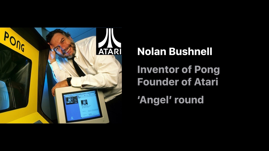
The original idea for Etak came when Stan Honey and a serial entrepreneur, Nolan Bushnell, were on a sailing boat together. Nolan had hired Stan to navigate his racing yacht through the 1983 Transpacific Yacht Race, a prestigious sailing event that spanned 2,225 nautical miles of open ocean from Los Angeles to Honolulu.
Nolan was famous for inventing the first video game, Pong, and later for founding Atari.
The story is recounted by Benj Edwards in his fantastic article for Fast Company: “Who Needs GPS? The Forgotten Story of Etak’s Amazing 1985 Car Navigation System“:
[Early one morning Stan and Nolan were on night watch together.] They began brainstorming about a computer-based navigation system for use on land. Stan thought a navigation system for automobiles could operate based on dead reckoning and comparing one’s current location to known points on a map, a technique known as map matching. It wouldn’t need satellites at all, just a good digital map, a good compass, and some sensors. Then it could display the result on an electronic screen.
Nolan reaction: “Yeah, let’s do that and I’ll fund it”
Nolan always had an appreciation for where consumer technology might eventually go. In an interview for Inc. magazine in 1984 he said “Let’s say you’re in your car, and you want to go to dinner. You’ve got this box on the dash. You punch in ‘Japanese,’ then ‘cheap,’ then ‘good sushi.’ The box takes over and guides you to a place.”
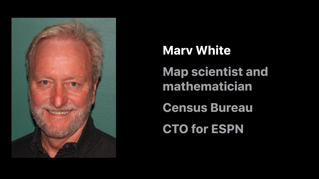
One of Etak’s key hires was Marv White. Marv was a map scientist and mathematician and worked at the US Census Bureau on their mapping program.
Under Marv’s direction Etak’s map digitizing productivity was three times the industry standard. Since leaving Etak, Marv has gone on to many exciting ventures, including a period as Chief Technologist for Innovation at ESPN.
There were many other supremely talented engineers behind the Navigator, many of whom previously worked at SRI International: Ken Milnes, George Loughmiller and Alan Philips to name a few.
Many of the original hires at Etak went on to other mapping organizations, including yours truly. When I worked on the Apple Maps team, 12 of my colleagues were Etak alumni.
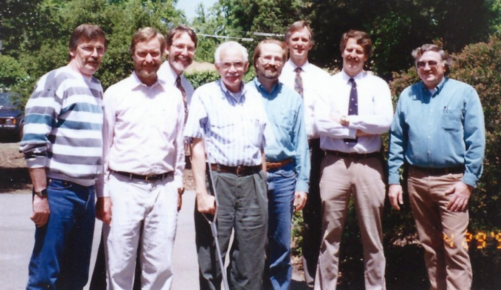
Etak Staff in 1993:
Terry O’Brien, Marv White, Walt Zavoli, Alan Philips, Jamie Buxton, Ken Milnes, Stan Honey, Gerry RussellSo What Happened to Etak?
The Etak Navigator was about 20 years ahead of its time. Due to the cost of the hardware and the expensive installation process building a sustainable business proved to be very difficult (sound familiar?)
Instead Etak quickly pivoted. It licensed the navigation code to the biggest automotive OEM hardware manufacturers at the time: Robert Bosch in Germany, GM in the USA and Clarion in Japan. In turn these companies developed their own navigation systems and, many years later, the concept of a ‘Personal Navigation Device’ from the likes of Blaupunkt, Garmin, Magellan, TomTom and many others was born.
During the course of doing business Etak attracted the attention of a perhaps an unusual suitor: Rupert Murdoch’s News Corporation. It was News Corps’ John B. Evans that saw the potential.
Like Nolan Bushnell, John was a supreme visionary. You would often find him on the same platforms as Intel’s Andy Grove, Bill Gates and other technology megastars. Albert Scardino and Matt Falloon recount the story in John’s obituary in the Guardian:
The defining deal of [John’s] career came in the mid-1980s. In 1985, Murdoch invested $350m in a group of travel publications and directories. With one hand, Evans took over the consumer magazine division of Murdoch’s US organisation, including TV Guide, Elle and one he himself invented, Automobile. With his other hand, he launched a secret project in a suburban office building to develop a part of the travel group, the Hotel and Travel Index, into a new media product, codenamed Jaguar.
In the days before streaming video and large file capacity on the internet, travellers’ views of their hotels and destinations were limited to tourist brochures. Jaguar allowed an electronic visual tour of destinations, complete with views of the hotel room they had booked. Once integrated with major airline booking information and other databases and cross-referencing tools, the system threatened to leapfrog other airline, car and hotel reservation systems.
It was thus that John had the vision to use Etak’s maps and technology to benefit the Jaguar system. Thus John convinced Rupert to buy Etak.
Stan Honey recounts the conversations:
John instantly saw the power of maps in media to change the world of classified ads, yellow pages, travel, and broadly answer the questions of “where is the nearest?” and “how do I get to it?”. Naturally, John and my shared sailing background created an instant group of common friends and experience. I remained close friends with John until he passed away and visited him often. Long after John had left News Corp, whenever I was tee’d up in New York waiting for a weather window for a Transatlantic record attempt under sail, I’d always invite John to come visit the boat, which he found fascinating as the boats were 100 foot monohulls or multihulls. I doubt that Etak would have ever appeared on Murdoch’s radar screen without John Evans’ vision and commitment to his vision, and to Etak. At the time of his decision to buy Etak, Murdoch also asked Barry Diller, who was then running Fox, for his opinion. Barry Diller was hard-nosed and direct in his questions, and had a slightly shorter term vision than did John, but Barry also supported News Corp’s acquisition of Etak, and focus on the maps.
John really was a long-term visionary, as was Nolan Bushnell. During the Etak days, both would visit and “wind-up” the Etak crew with their predictions. That was very helpful as the two of them kept our minds wide open. But it was also helpful that they would mostly stay away because we were burdened with the need to actually get things to work, which visionaries seldom are. It is interesting to note that all of the things that Nolan and John predicted, have happened. It is also interesting to remember how far-fetched they seemed at the time of their visits.
But the times there are a changin’: as fate would have it in 1989 Murdoch sold the Jaguar system to Reed International for a profit of $500M. With Jaguar sold the relevance of Etak to New Corp lessened.
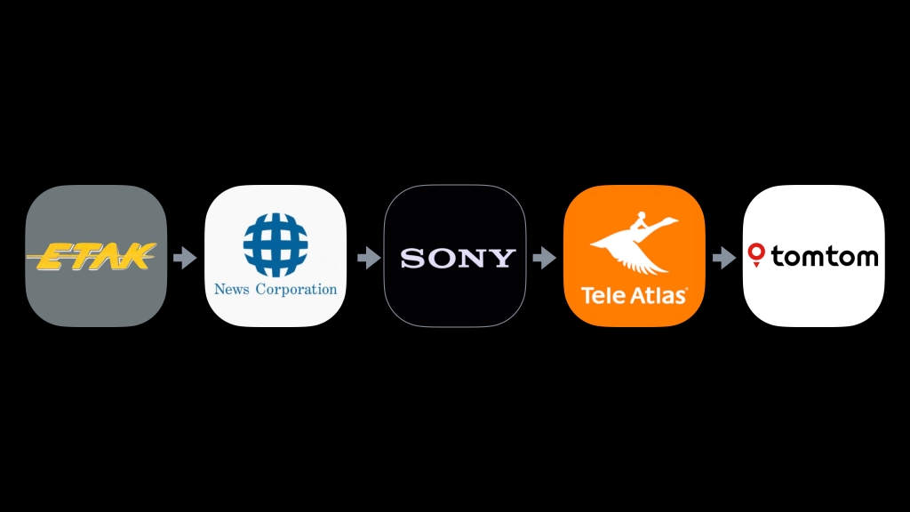
News Corp subsequently sold Etak to SONY, who then later sold it to Tele Atlas. And still later Tele Atlas was subsumed by TomTom. So what was originally Etak is now TomTom:
But Why the name ‘Etak’?
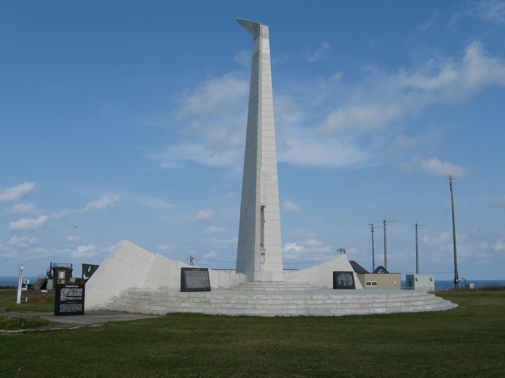
The answer goes back to the early days of Polynesian navigation. In those days the ancient mariners navigated the seas by relying on a series of environmental cues, such as the positions of islands around them.
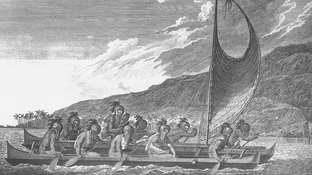
They imagined that that their boats were stationary and that the islands moved past them.
In the same way, in the Etak Navigator the vehicle is stationary and it’s the maps that move past the vehicle…
With that in mind, Stan decided to call his company Etak, which is a Polynesian term for moving navigational reference points.
But Wait, There is One More Thing…
When you look at any consumer mapping app in navigation mode, have you noticed something?
Have you noticed something about the symbol used to denote vehicle location?
Does it look familiar? Well, of course it does …
So it turns out the symbol used by all navigation apps today is the same one originally invented by Etak.
But why did Etak use that particular symbol?
If you talk to the engineer who wrote the original code, George Loughmiller, he’ll be meek and tell you that it seemed like a good idea at the time. But you have to remember one thing: Etak was incubated by Nolan Bushnell, founder of Atari. And at that time both Etak and Atari were housed in the same office building at 1287 Lawrence Station Road in Sunnyvale, California.
Because Etak used a vector display with limited CPU, George needed a symbol that didn’t burden the very scarce computing resources. He also needed a symbol that was easy to read. A traditional symbol for a car — 🚗 — required too many lines. It also didn’t clearly connote direction. Something simpler was needed.
Legend has it that one of Etak’s engineers got to see a pre-release demo of one of Atari’s latest games. And that game was…

And what symbol did Asteroids use for their spaceship?
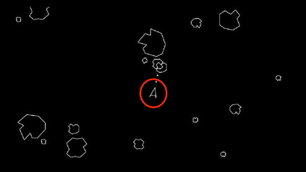
And thus the symbol for vehicle navigation was born and is still used by all navigation apps globally today:

So There You Have It…
Every once in a while, a revolutionary product comes along that changes everything.
Etak’s many significant inventions included:
- the world’s first in-vehicle nav system that actually worked
- augmented dead reckoning using map matching
- moving map heads up display
- first use of geocoding in a consumer application
- algorithms for highly efficient map data storage and retrieval
- heads up digitizing
- the world’s first high volume digital map production system
- inventor of the universal map navigation symbol
I was but a pimply engineer at the time. Little did I know when I joined Etak in 1985 that I was going to be part of such an illustrious team.
My hats off and best wishes to everyone I worked with: it was a privilege, an honor and an amazing journey. Thank you.
Acknowledgements, Further Reading & Watching
- Stan Honey, Marv White and the rest of Etak team
- Benj Edwards: “Who Needs GPS? The Forgotten Story of Etak’s Amazing 1985 Car Navigation System” (2015, Fast Company)
- Popular Science Article from June 1985: Credit: Stan Honey and Popular Science Magazine
- The Etak Business Plan: May 10, 1984: Credit: Computer History Museum
- Rare and interesting documents about Etak: Credit: Computer History Museum
- Etak Innovations: Credit: Stan Honey
- Etak’s Initial Product Brochure from 1985: Credit: Stan Honey
- Paper presented at the Royal Institute of Navigation meeting in York 1985: Credit: Stan Honey
- Etak Navigator Tour & Demo: Credit: EllsworthC on YouTube:
-
12 Map Happenings that Rocked our World: Part 8
Oh Brother, Where Art Thou?
So you think you know where you are? And how did you deduce that seemingly trivial fact, I wonder?
Yes, dear reader, determining your location is no longer an arduous task. But you should quickly remember that for the average Joe or Jolie it’s only been that way for a very short while.
It took the pervasive proliferation of those pocket computers we now all carry around to make it so.
But only by 2016 did global penetration of smartphones cross 50%1, so you could argue that it’s only been 8 years since the majority of people on this planet have been able to quickly determine their location.
That’s actually a pretty astounding fact.
Yeah, yeah — I know — there was a way to quickly determine your location prior to the dawn of iPhone. You could use your favorite personal navigation device (PND). But that only helped if you were in your car. And global penetration of PNDs never got a smidgeon close to smartphones.
This innate ability to determine your location can take so much stress out of you life. No longer do you have to roll down the window of your car in shame and, most of the time at least, no longer do you have to be so stressed about getting lost when you’re on a leisurely country walk.
For those of you that don’t remember, this is what it used to be like [click to play]:
What it used to be like asking for your location. Credit: California Map & Travel Center Yup, that fear of being maced and tasered has receded somewhat.
However, I should also offer the rebuttal to say that easy location determination has substantially increased our stress levels: it’s made possible by all those slimy apps that track your every move. See Map Happenings post: “Location Harvesters, Personal Information Brokers & Assholes“.
Moving on.
What effect has all this easy location determination had on our world? The list is of course somewhat substantial:
- Real-time navigation — by car, by train, by bicycle or on foot
- An explosion of tracking apps for vehicles, shipments, rides, deliveries, aircraft, boats — and let’s not forget tracking birds and animals
- A complete revolution for search & rescue
- A complete revolution for surveying & construction
- Enabling a geo-index of nearly everything (photos anyone?)
- The foundation for self-guided machines — tractors and bulldozers, drones and perhaps one day: cars & trucks
So, it’s pretty easy to make the case that this phenomenon should win a spot on the list of “12 Map Happenings That Rocked Our World”. But how did it all come about? And what remains to be done?
If you’re so inclined I’ll take you though the story of how we got to where we are… and a little bit of where we’re headed. It ain’t all down to GPS.
Determining Your Location: First Things First
A couple of things had to happen:
- Someone had to invent maps (see “12 Map Happenings That Rocked Our World: Part 1: The First Map“)
- Someone had to invent a coordinate system (see”12 Map Happenings That Rocked Our World: Part 2: The Birth of Coordinates“)
Then someone had to invent how to determine your location. Figuring out your latitude (how far north or south you are) was a relative breeze. But by comparison, determining your longitude (how far east or west you are) turned out to be a real stinker of a bitch.
The story of how this problem was solved is an epic tale. TL;DR: the problem was solved by an uneducated carpenter from the north of England in the year 1759. It was all about clocks.
If you’d like to delve deeper may I suggest three options:
- Option 1: if you have 15 minutes: read “12 Map Happenings That Rocked Our World: Part 4: The Epic Quest for Longitude“
- Option 2: for the full story: read Dava Sobel‘s amazing and best-selling book ‘Longitude‘.
- Option 3: if you’re like certain politicians and have difficulty reading: watch the PBS video “Lost at Sea” narrated by Richard Dreyfuss. Actually — even if you can read — watch the video anyway. It’s such a cool story.
Precursors to GPS: Acoustic Locators, Gee & LORAN
Acoustic locators came first. They were used in World War I to determine the location of enemy artillery. The system employed microphones to measure the direction that artillery fire was coming from. With the use of two or more microphones at different known locations it was possible to determine the location of artillery using simple trigonometry.
But these weren’t like your average Shure microphones you use for podcasting. Take a look at this one from 1927:
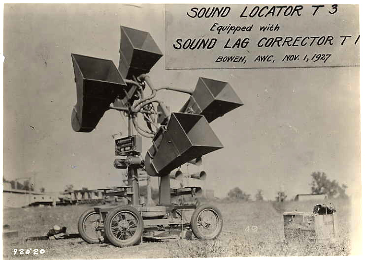
T3 Sound Locator 1927 — Credit: Wikimedia Or these Japanese ones from before World War II:
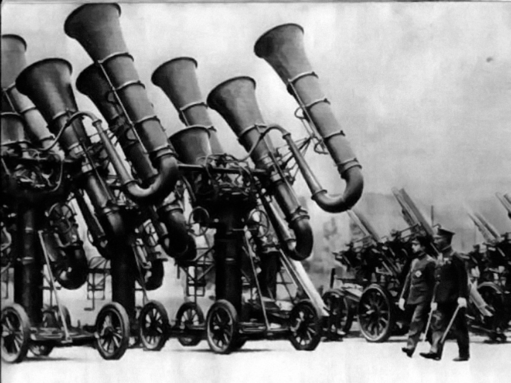
Pre-World War II photograph of Japanese Emperor Shōwa (Hirohito) inspecting military acoustic locators mounted on 4-wheel carriages — Credit: Wikimedia Next up: Gee.
Gee, not to be confused with the clarified butter you might find in an Indian deli, was a radio navigation system invented by the Brits during World War II. By measuring the time delay from radio signals emanating from multiple known locations it was possible to measure position using a method called hyperbolic navigation. Gee’s main purpose was to allow bombers returning from a night bombing raid find their landing strips, thereby providing a blind landing system.
The methodology was a follows:
Two transmitting antennas positioned about 10 miles (16 km) apart on either side of a runway. A transmitter midway between the two antennas would send a common signal over transmission lines to the two antennas, which ensured that both antennas would broadcast the signal at the same instant.
A receiver in the aircraft would tune in these signals and send them to an [oscilloscope]-type display… If the aircraft were properly lined up with the runway, both signals would be received at the same instant, and thus be drawn at the same point on the display. If the aircraft were located to one side or the other, one of the signals would be received before the other, forming two distinct peaks on the display. By determining which signal was being received first, pilots would know that they were closer to that antenna, and would be able to recapture the proper direction by turning away from it.
The guy that invented Gee, one Robert Dippy, later went on to help the Americans develop a longer range version, called LORAN — short for LOng RAnge Navigation.
How did LORAN Work? Well here’s a short 2 minute video courtesy of the Smithsonian Institution:
How LORAN positioning system works — Credit: Smithsonian Institution LORAN evolved over the years. It first went live in June 1942 and was declared operational in early 1943. The original system begat LORAN-B (which was a failure), but that begat LORAN-C. The US LORAN-C transmitters became operational in 1958 and were managed by the US Coast Guard. The original LORAN-A systems remained operational until about 1985. LORAN-C was opened to civilian use in 1974 and the US transmitters were finally shut down on 8 February 2010.
Has it all been replaced by GPS? Well as a matter of fact just like vinyl records, it is getting a revival. With the potential vulnerability of today’s satellite positioning systems due to GPS interference a new version of LORAN is being explored and selectively deployed. Called Enhanced LORAN or ‘eLORAN’ it is under consideration by a number of nations. Other countries continue to operate LORAN transmitters around the world.
GPS and its Catalyst
I think pretty much everyone has at least heard the term ‘GPS’. It of course stands for Global Positioning System. And, surprise, surprise, it has its origins in the US military. The GPS system is owned by the US government and is now operated by the US Space Force.
The catalyst for developing GPS all started after the USSR launched the first man made satellite, Sputnik 1, way back on 4 October 1957. Within hours of its launch two enterprising chaps, William Guier and George Weiffenbach, who were physicists at the Johns Hopkins Applied Physics Laboratory (APL) realized they could determine the satellite’s position by monitoring the radio signals and measuring the changes in frequency of the signals at known locations on the earth due to the doppler effect.
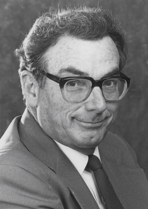
William H. Guier (1926-2011)
Credit: Johns Hopkins APL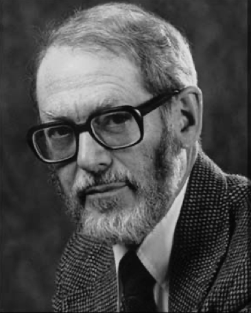
George C. Weiffenbach (1921-2003)
Credit: Johns Hopkins APLIt wasn’t long before the laboratory’s deputy director, Frank McClure, asked them to invert the problem: could they pinpoint a user’s location given a known position of the satellite’s?
And why was this so interesting? Well it all comes down to the fact that the US needed more effective ways to blow up the planet and one of them was by putting nuclear warheads on submarines. But a missile fired from a submarine couldn’t turn Moscow into a blob of molten glass unless you knew the exact position of the submarine relative to Moscow, preferably within a few hundred feet.
It turns out we can pinpoint the exact date on which the whole idea for satellite navigation was birthed. Guier and Weiffenbach’s recount the story in their 1998 paper:
From here on, we were in for the adventure of our lives. On Monday, 17 March 1958, Frank McClure called us to his office and asked us to close the door. He asked us if anything new suggested that we had exaggerated our claim that we could find an approximate orbit from a single pass of Doppler data. When we replied that nothing had really changed, “Mac” asked if we could invert the solution, i.e., determine the station position while assuming the orbit is known.
This all led to the development of something called the Transit Navigation System. The first attempt to launch a prototype satellite for Transit was in September 1959 and the whole thing became fully operational in 1964. It was used primarily by the US Navy to provide accurate location to its fleet of Polaris ballistic missile submarines. Transit had a long history and didn’t cease its navigation service until 1996 by which time it was made obsolete by GPS.
A Transit 2A Satellite during launch preparations — Credit: Wikimedia If you want to dig deeper into the technical methodology behind Transit then I’d suggest reading Wikipedia’s page.
What of GPS?
Although groundbreaking the Transit system was deemed too slow and too intermittent to keep up with the speed of airplanes. A more accurate and reliable system was needed.
Fortunately Transit was not alone and in the 1950s and 60s several other systems were developed in parallel. All of them had one goal in mind: getting an accurate fix of land or sea based missile launchers before they launched nuclear armageddon. These other systems included:
- MOSAIC (1950-61): ‘MOSCAIC’ was developed by the Missile Division of Raytheon and stood for “MObile System for Accurate ICBM Control” It was essentially a 3D LORAN.
- Project 621B (1963-73): Developed by the Aerospace Corporation (1960-present) this proof of concept project had over 1400 scientists and engineers on staff. Aerospace had been commissioned by the US Air Force to continue work on determining navigation coordinates from satellite signals and in particular meeting an accuracy requirement of 15 meters. Through its fundamental research Project 621B laid many of the foundations for GPS. By the late 1960s Aerospace recommended a design that used 20 satellites placed in geosynchronous orbit.
- The Timation Satellites (1964-74): these proved the feasibility of orbiting accurate clocks in space, a necessary requirement for GPS. In essence this was a 20th century version of John Harrison’s H4 chronometer from 1759 (see “12 Map Happenings That Rocked Our World: Part 4: The Epic Quest for Longitude“). The pièce de résistance was the July 1974 launch of the third Timation satellite which was the first to fly an atomic clock.
By the late 1960s it was clear that a solution to meet all the requirements was going to need a boat load of coordination and a boat load of money. So in 1968 the US Army, Navy and Air Force combined forces to form NAVSEG (Navigation Satellite Executive Group).
Alas, the group had no power to enforce any decisions it made. So in 1969 the president of Aerospace, Ivan Getting, asked president Nixon’s science advisor for help. Rather than advocating for a presidential commission the advice was to continue to push the ideas through the military customers. It turned out to be an astute move.
Ivan Getting (1912-2003)
As the first president of Aerospace, Getting oversaw the development of Project 621B, the precursor to GPS.
Credit: Aerospace CorporationThe main customer ended up being a chap called Air Force Colonel Bradford Parkinson. Put in charge of Project 621B in 1972 he concluded that some elements of Project 621B, Timation and Transit were all needed if satellite navigation were to be truly successful.
On April 17, 1973 the US Department of Defense authorized the creation of the GPS Join Program Office with Parkinson as its lead. Over large meeting held over the Labor Day weekend in 1973, Parkinson was able to convince his cohorts in the military on a design for a system. The decisions about the system made at that meeting still prevail today.

Brad Parkinson (b.1935) served as the first program manager of the GPS Joint Program Office, established in 1973.
Credit: Aerospace CorporationApproval was given to start work on 22 December 1973. Initially called “Navstar” and later “Navstar/GPS” and then simply “GPS” it was given a starting budget of US$150 million. It eventually cost around US$12 billion to build and deploy. Today the operational costs of GPS are about US$2 million per day.
Over the next 15 years GPS development proceeded apace. Between 1977 and 1979 more than 700 different tests were conducted and various test satellites were launched.
Well after midnight on 19 July 1977, a Rockwell Collins engineer named David Van Dusseldorp sat on the rooftop of a company building in Cedar Rapids, Iowa, adjusting an antenna every five minutes to receive a signal from the world’s first Global Positioning System (GPS) satellite, known as NTS-2.
His GPS receiver was a little more cumbersome than one you might be used to using today:
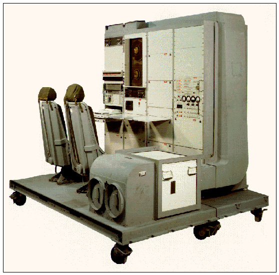
The World’s First GPS Receiver manufactured in 1977 by the Collins Government Avionics Division of Rockwell International. It weighed more than 270 pounds.
Credit: The Institute of NavigationOver the subsequent years more and more satellites were deployed. It took until 1985 before the production and development stage began. The first “Block II” operational satellite was launched in February 1989:
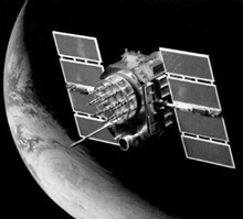
A GPS Block II Satellite from 1989 — Credit: Aerospace Corporation GPS got its first test in 1990 following the Iraqi invasion of Kuwait where the system provided invaluable navigational information to all branches of the allied forces. Media’s coverage of GPS’s use in the war helped increase awareness of the system and helped stimulate commercial interest.
By the time GPS was fully operational its future success was virtually guaranteed.
Getting to Where We Are Today
Initially the US Department of Defense kept GPS just for themselves. There was no access for commercial or consumer use.
But everything changed on September 1, 1983 when a Korean Airlines 747 jumbo jet en route from Anchorage to Seoul strayed into Soviet airspace and was shot down by a Sukhoi Su-15 interceptor. All 269 passengers and crew on board perished.
As a result of the incident president Ronald Reagan issued a directive making GPS freely available for civilian use.
“The Tower of Prayer”, a monument to KAL 007 at Cape Sōya, Japan. The monument is at the closest land point to where the aircraft was downed. Credit: Wikimedia But Reagan’s directive wasn’t sufficient to support consumer navigation as we know it today. The US government had implemented a filter called ‘Selective Availability’ which degraded the accuracy of the GPS signal for civilian use. It added intentional time varying errors of up to 100 meters (>300 feet) to prevent enemies of the US using civilian receivers for weapons guidance. So… no sat-nav systems yet suckers!
But there was a workaround. Because Selective Availability affected every GPS receiver in a given area almost equally, a fixed station with a known position could transmit the error to other receivers in the area. This methodology got a name: Differential GPS or DGPS.
DGPS became so effective that it essentially overcame the original intent of Selective Availability. Eventually common sense prevailed and president Clinton ordered Selective Availability to be switched off on 1 May 2000.
What of nefarious groups using GPS? Well the US military developed a new system that provided them the capability to deny GPS to hostile forces in a specific area of crisis.
Of course with the advent of GPS other nations around the world were suddenly at a serious disadvantage. Friendly nations were beholden to the US. Enemies of the US were suddenly in deep, deep yoghurt. So of course other systems sprung up:
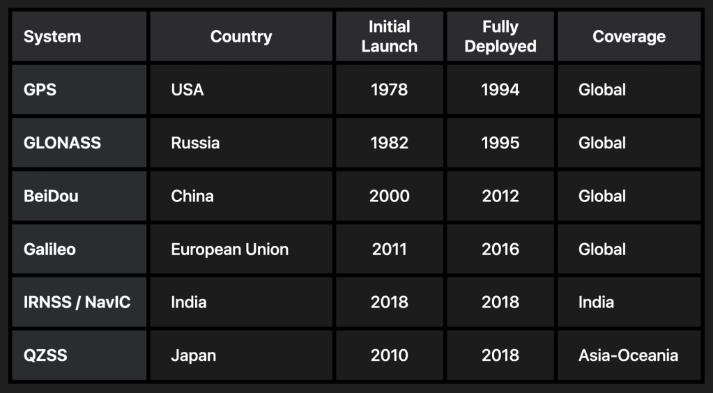
Of note: you’ll see all these systems listed in the location specs for iPhone.
Now Don’t Go Thinking GPS is Infallible…
So when you open up you favorite mapping app you’ll see that little blue dot magically zooming to your current location.
So you might think all the app is doing is simply taking a GPS reading and plotting it on the map.
Ha, sucker. It turns out it ain’t that simple.
First: it’s common that you aren’t going to get any GPS signal when you have a roof over your head.
Second: if you’re in a city with tall buildings those GPS signals are going to bounce of the side of the buildings like a ping pong ball and as a result give you all kinds of false readings.
Third: it helps to stay still. If you’re moving you’re going to get a less accurate GPS reading. The faster you move the worse it gets.
The iPhone specs give you a clue that it takes more than GPS to get that nice blue dot:

Notice “Wi-Fi” and “Cellular”? Those two in particular play a big role in keeping your blue dot roughly correct.
In lieu of GPS a rough position of your phone can be determined by looking at which cell phone towers your device is seeing and triangulating a position from that:
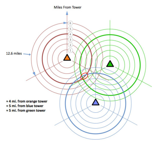
Determining location from Cell Phone Towers — Credit: GP Yes It works, but only roughly (typically in the region of a few hundred meters).
Wi-Fi positioning works using a harvested database of known Wi-Fi router (a.k.a. Wi-Fi access point) locations. Similar to the idea behind cell phone tower triangulation where you know the location of the cell phone towers, this methodology works in roughly the same way.
But you need to build up a database of Wi-Fi router locations to make it work. Google got into a shit load of trouble for harvesting this data secretly back in 2008-10. How did Apple get access to similar information? Frankly, I’m not sure, but I’m guessing it was harvested from those billions of iOS devices that have a habit of wondering around.
Another way to keep the location accurate is to use location history. If at one point you know you’re at a specific location and then your phone’s compass and movement sensors see you heading in a particular direction at a particular speed then you can deduce your position at a later point in time. This methodology is called ‘Dead Reckoning‘. It has its limitations, but it stops the blue dot from jumping around too much.
Another method is to use known information about your current method of traveling. If you’re in navigation mode in your car, then hopefully it’s quite likely that you’re actually driving on a road. So the app can ‘snap’ the blue dot to the road.
As I’ve already opined there is a need for an accurate location across many, many applications and industries. As such much effort, time and money is being spent to improve location accuracy.
One method is called RTK (Real Time Kinematic) and was invented in the early 1990s. Basically it’s an evolution of the Differential GPS methodology that was used as a workaround for Selective Availability. It relies on a group of geographically distributed basestations on the ground that are at known locations.
In the last few years the big boys have introduced yet another way of determining your location. It’s called ‘Visual Localization’ and matches what your phone’s camera sees to a known database of 3D buildings. Apple Maps introduced this capability three years ago:
Apple Maps launched Visual Localization in 2021 — Credit: Apple Indoor Positioning
Getting your position inside a building is a tough cookie. Several approaches have been tried and one of the most common “solutions” has been to push the idea of triangulation using Bluetooth beacons. Little do people know that in order to make it work you have to carpet bomb buildings with hundreds (if not thousands) of beacons. And then you have to replace the batteries in them every few months. Net/net: it doesn’t scale baby.
Another approach, used by Apple, is to employ a method called Wi-Fi fingerprinting. Apple’s Indoor Positioning system relies on this method by recording the interference patterns of the Wi-Fi radio signals inside a building. It’s also not infallible but at least you don’t have to install huge mountains of beacons.
The topic of indoor positioning is worthy a whole separate Map Happenings post. There are just so many misconceptions about so called “solutions”.
Underground Positioning
Have you ever wondered how two tunnel boring machines can start burrowing a tunnel many miles apart and miraculously end up meeting in near perfect alignment? It’s always fascinated me anyway. Particularly when these machines weigh thousands of tonnes and, well, have a tendency to sink.
GPS, Wi-Fi and Cellular methods are obviously not suitable. So how do they do it? The answer is using laser guidance. One of the leading companies to provide a solution in this space is a German company called VMT. Here’s a short video from their web site [click to play]:
VMT Navigation System for Tunnelling Machines — Credit: VMT Where Next?
With recent scary stories like the one about the Russians equipping their satellites with nuclear weapons, nations around the world are naturally nervous about the vulnerability of their satellite positioning systems. For example, GPS relies only on 24 active satellites to make it all work. You only have to knock a few out and GPS is pretty much kaput.
As a result the US Space Force is eyeing smaller, cheaper satellites to augment the GPS constellation. This would not only reduce the costs of the overall system but it could additionally reduce its vulnerability.
And it also sounds like everyone’s BFF, Elon Musk, could be considering a commercial positioning system.
But I’ll leave you with one more positioning technique that is currently being researched by Hiroyuki Tanaka at the Earthquake Research Institute of The University of Tokyo. Here’s his paper in published in the esteemed journal, Nature, and a subsequent one published in Cell.com.
The concept is to utilize the relativistic and penetrative nature of cosmic-ray muons, thereby developing a completely new wireless navigation technique called wireless muometric navigation system (MuWNS). To quote the paper’s authors:
This paper shows the results of the world’s first physical demonstration of MuWNS used on the basement floor inside a building to navigate (a person) in an area where global navigation satellite system (GNSS)/ global positioning system (GPS) signals cannot reach. The resultant navigation accuracy was comparable or better than the positioning accuracy attainable with single-point GNSS/GPS positioning in urban areas
Yes, dear reader. Muons.
Footnotes:
- Source: Frederica Lariccia at Statistica: Number of smartphones sold to end users worldwide from 2007 to 2023 ↩︎
References and Acknowledgements:
- Steven R. Strom: “Charting a Course Toward Global Navigation“. Steven is the corporate archivist for Aerospace Corporation
- Aerospace Corporation: “The History of Aerospace“
- The Institute of Navigation (ION): Navigation Museum
- Galileo GNSS: “First GPS signal received 40 years ago“
- Mark Burdon and Alissa McKillip: “The Google Street View Wi-Fi Scandal and its Repercussions for Privacy Regulation“
- Wikimedia for Wikipedia. Where would we be without you?
- VMT GmbH
-
12 Map Happenings that Rocked our World: Part 7
Those Views from Above…
To all of you young whippersnappers that take your many ‘entitlements’ way too much for granted: you simply have no inkling of just how lucky you are. To name just a few:
- The interweb
- Pervasive Wi-Fi (or ‘whiff-ee’ as those suffering from Frenchness have a habit of calling it)
- More than 128K of RAM or 1MB of storage space
- Abundant electricity
- Indoor loos
In my day we had it tough. We were lucky to have a cup of tea — and a cup of cold tea at that.
For those of us curmudgeons who’ve been in the mapping business for a while we should add one key item to this list: it’s the luxurious abundance of “views from above” … otherwise known as aerial imagery.
Aerial imagery has changed how we see the world, it’s changed the way we map the world and it’s changed the way we understand the world.
Many of you will know that back in 1985 as a young lad I worked on the team that pioneered the world’s first in-car navigation system, the Etak Navigator. The Navigator was nothing without its digital street maps, and because no one else had created them we had to make the maps ourselves.
This was not a trivial task. There was no Google Earth. There were no satellite views. And aerial photos were about as scarce as seeing a progressive at a MAGA rally.
To make our digital maps we had to make do with something called USGS Quads — printed maps at 1:24,000 scale that had been made by the US Geological Survey. Some of these maps were relatively new and had been created in the last year, and some of them, well — let’s just say they were a little long in the tooth — and were about 30 years old.
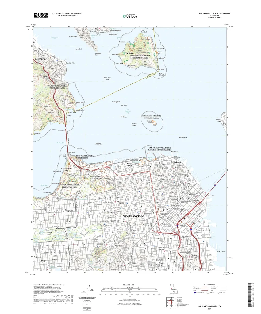
USGS Quad of San Francisco — Credit: USGS So the digital maps we created were far from being up-to-date. And we knew that. So much so that when we gave people the opportunity to challenge our address finder we always asked them “Where did you grow up?” rather than “Where do you live?”, knowing that we had a much better chance of getting the first question correct. 😜
So where did all these views from above emanate?
Well, the first known aerial photograph was taken in 1858 by French photographer and balloonist, Gaspar Felix Tournachon, a.k.a “Nadar”. And, clever chap, in 1855 he patented the idea of using aerial photographs for mapmaking.
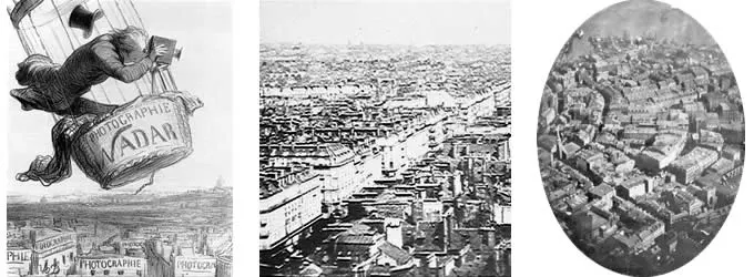
Gaspar Felix Tournachon, a.k.a. “Nadar” and his balloon photography
Credit: Professional Aerial Photographers Association (PAPA)But photographs weren’t only taken from balloons. No, ingenious people also used kites and even pigeons. In fact in 1903 in Bavaria they even established the Bavarian Pigeon Corps for aerial reconnaissance. Managing flight paths proved to be a somewhat interesting challenge, however.
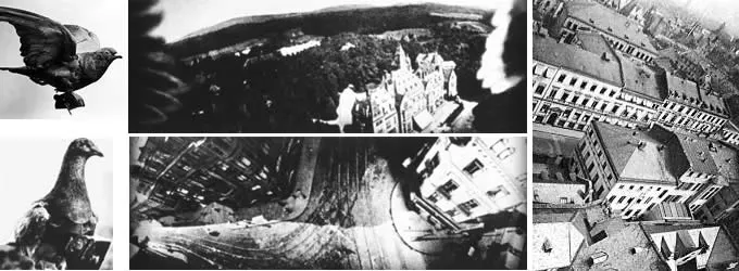
Aerial photographs taken on pigeon photo flights. Note the wingtips!
Credit: Professional Aerial Photographers Association (PAPA)It was none other than a rather famous fellow called Alfred Nobel that took things to the next level in 1897. He produced the first successful aerial photograph from a rocket mounted camera.
But all this was before planes and, perhaps not surprisingly it was Mr. Wilbur Wright who took the first photograph from an airplane (in Italy!) in 1909.
As is often the case it was warfare that accelerated progress. First in World War I, where aerial photography quickly replaced sketching and drawing by people in planes. By the end of this war both sides were taking pictures of the battle fronts at least twice per day.
It was Sherman Mills Fairchild (1896-1971) who we should thank more than anyone for making the greatest advancements.
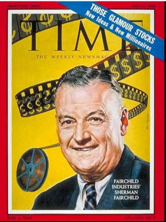
Sherman Fairchild on the cover of Time Magazine in 1960
Credit: Time MagazineAlas, in our world of 21st century high tech, Sherman Fairchild has unfortunately become a rather forgotten hero.
Over the years Sherman Fairchild founded over 70 companies and they became famous for their focus on aviation, cameras and semiconductors.
For those of you that know how to use a rotary dial phone you might have heard of a famous Silicon Valley company called Fairchild Semiconductor. Sherman founded the company in 1957 and it became a pioneer in the manufacturing of transistors and integrated circuits.
Probably what you don’t know is that Fairchild Semiconductor started as a division of Fairchild Camera and Instrument, itself established in 1927.
Dig deeper and you’ll find a story behind this company too:
In 1917 Sherman Fairchild had been rejected from serving in the military due to his poor health. Determined to find another way to support the war effort he went to Washington and won a government contract to develop an improved aerial camera.
His secret sauce: a camera specially designed for use in airplanes where stability and shutter speed remained a problem. By the end of the war Sherman had developed a camera with the shutter located inside the lens. This significantly improved the image quality and became the standard for aerial camera systems over the next 50 years.
In 1921 Fairchild Aerial Surveys started a commercial program to perform aerial surveys of cities and on August 4, 1921 the company produced a series of 100 aerial photographs of Manhattan at an altitude of 10,000 feet:
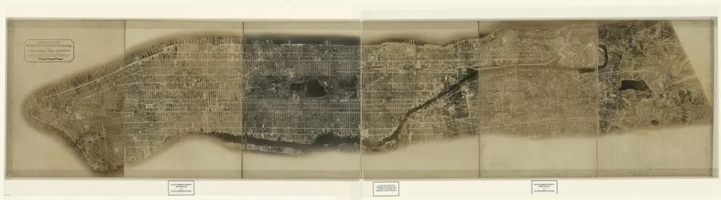
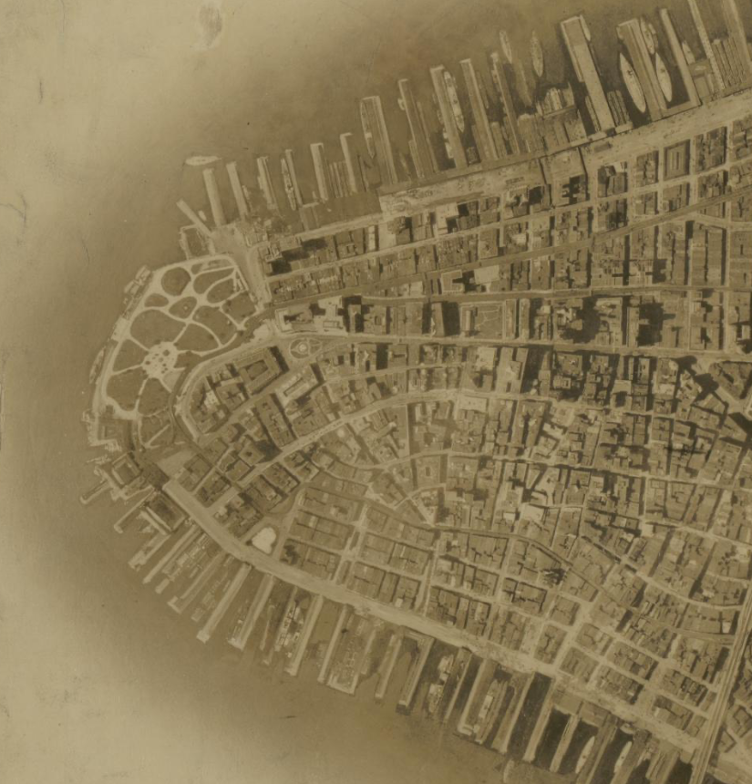
Fairchild Aerial Photo of Manhattan, 1921 — Credit: US Library of Congress By World War II over 90% of the aerial cameras used by the allied forces were designed or made by Fairchild.
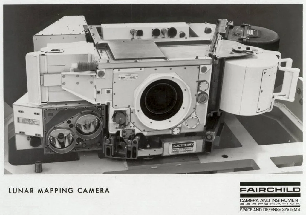
Here’s the clincher: before Fairchild died in 1971, he saw his cameras carried on Apollo 15, 16, and 17, and while astronauts explored the lunar surface, his cameras mapped the moon from the Command Module:
Fairchild Lunar Mapping Camera — Credit: Wikimedia But of course aerial photography doesn’t just come from planes. With the mad rush induced by the Cold War, it was satellites that came to dominate.
Here the Map Happenings accolade for rocking our world must go to none other than Landsat, a program conceived by NASA in the heady times of taming the atom and going to the moon.
From NASA’s history of the project:
In 1965, director of the U.S. Geological Survey (USGS), William Pecora, proposed the idea of a remote sensing satellite program to gather facts about the natural resources of our planet.
Pecora stated that the program was “conceived in 1966 largely as a direct result of the demonstrated utility of the Mercury and Gemini orbital photography to Earth resource studies.” While weather satellites had been monitoring Earth’s atmosphere since 1960 and were largely considered useful, there was no appreciation of terrain data from space until the mid-1960s.
After various political and military push backs NASA was eventually given the go-ahead to build the satellite in 1970. Within just two years, Landsat 1 was launched, heralding a new age of remote sensing of land from space:
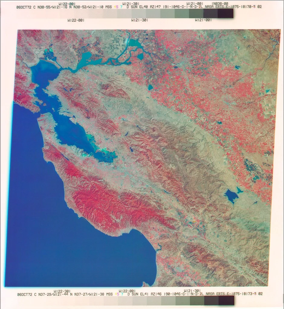
Landsat 1 Image from 1972 — Credit: NASA And it’s never been the same since…
If you want a great overview of what’s happened over the years, particularly in the world of satellites, then spend 20 minutes watching this very engaging video from my good friend, Max Lenormand, publisher of MindsBehindMaps:
Satellite imagery has revolutionized the world in many ways — for weather, for agriculture, for environmental studies and of course for the military — but perhaps the most profound way it has affected all of us is for its use in map making.
Without today’s copious abundance of high resolution aerial imagery there is no way the likes of map makers like Google, Apple, HERE, TomTom, Grab, Baidu, KakaoMap and Yandex could do what they do — not only to make their maps, but to keep them up-to-date.
Today companies like Maxar, Planet and Satellogic commonly provide photographic imagery with resolutions as small as 30 centimeters (~1 foot).
The resolution is not limited by technology. It’s limited by governments. No doubt military satellites are capable of single digit centimeter resolution.
But let’s not assume it’s still all coming from satellites. Aerial imagery from planes and drones is still extremely common and companies like Nearmap make a business out of selling imagery that’s “sharper than the best satellite imagery”.
It’s clear that Google and Apple perform their own surveys too. Here’s one of the many aerial screensavers that you’ll find in Apple’s macOS and tvOS:
Apple Screensaver for London — Credit: Apple Of course, there is just one fly in the ointment…
Yes, it’s called clouds.
Oh, and that thing called nighttime too.
But fear not, dear reader, there’s a solution for that too. It’s something called ‘SAR’ or Synthetic Aperture Radar. Invented by Carl Wiley at the Goodyear Aircraft Company in Arizona in 1951, SAR uses radar to see through clouds (and darkness) to enable high resolution imagery at any time and in any weather.
It was first used in the SR-71 Blackbird spy plane which entered service in 1966 — amazingly some 58 years ago!
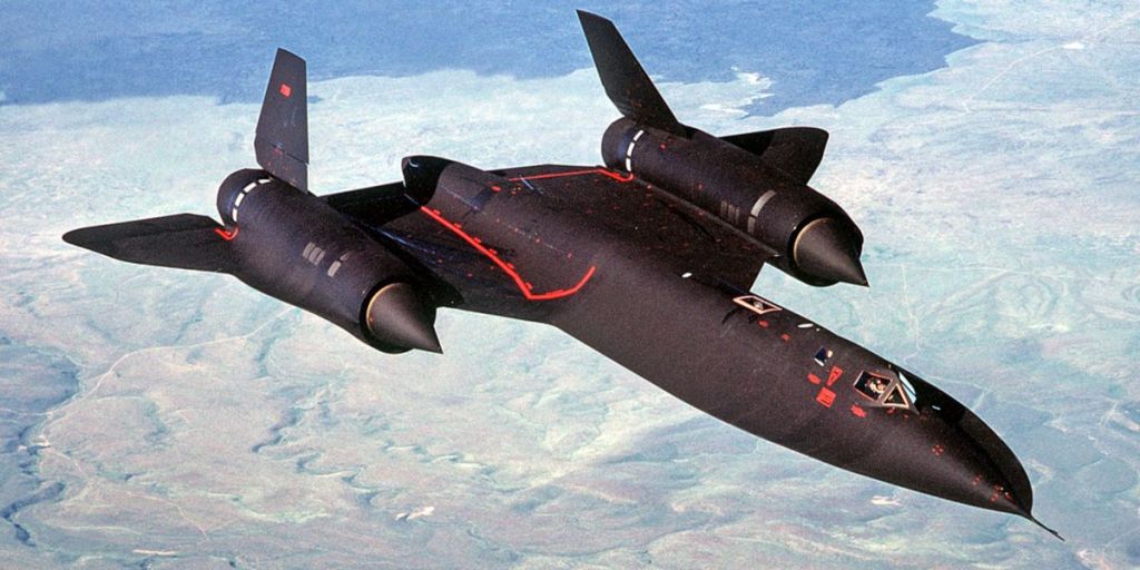
The SR-71 Blackbird — Credit: Popular Mechanics Magazine Now SAR images are readily commercially available from companies like Capella Space:
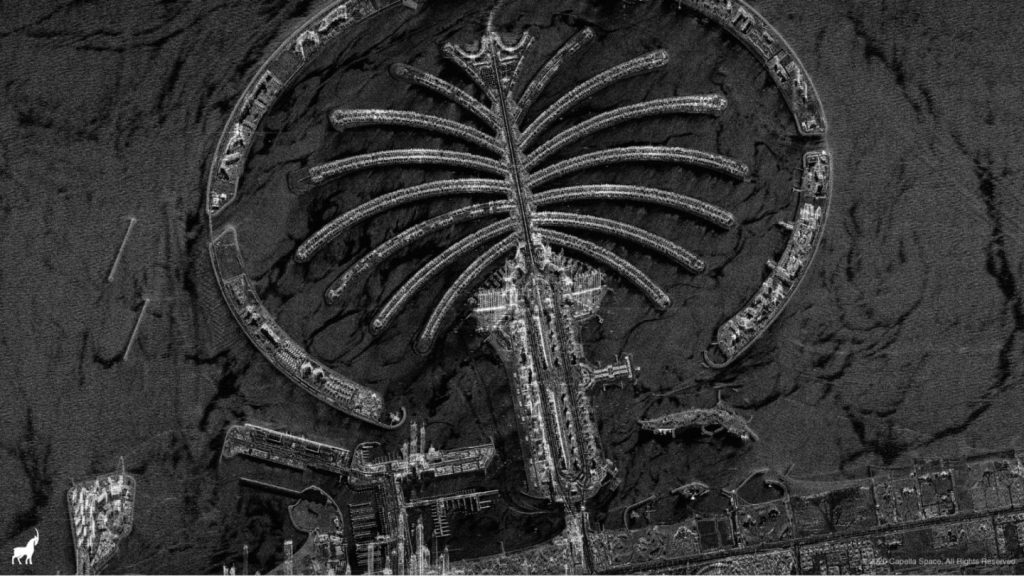
Image of Palm Island in UAE — Credit: Capella Space So when you’re next looking at a modern map — any modern map — think about how it was made and how it has been kept up-to-date. None of it would have been possible without those views from above.
Acknowledgments
- Professional Aerial Photographers Association (PAPA)
- US Library of Congress
- NASA
- Wikimedia
- Popular Mechanics Magazine
- Time Magazine
- Capella Space
- Apple
- Max Lenormand
-
Screw “Immersive Views.” A Santa Claus List for Mapping Apps. 🎅🏼
I’ve harped on about this before. In the last 10 to 15 years so called “mapping” organizations have veered more and more away from actual maps — in the true sense of the word — and have instead spent ungodly amounts of energy, time and money trying to recreate reality.
And for god’s sake, why?
No, I get it. It’s useful to help you get a feel for an unfamiliar neighborhood and perhaps its vibe. Unlike a simple aerial view you can swoop in, spin around and pretend you’ve suddenly morphed into some kind of acrobatic bird.
Perhaps it all started when John Hanke got on stage at Tim O’Reilly’s ‘Where 2.0’ conference in 2007 where he announced Google StreetView. I was there and I remember it well. StreetView was a ground breaker. It had one principal aim: enable people to get to know a neighborhood before they actually go there.
In 2012 there was another lurch towards immersive experiences: Apple announced Flyover. It was the first broadly available example of a feature that allowed you to arbitrarily fly around (a limited number) of cities as though you were actually there. Ignoring the faux pas of the actual launch, Flyover really was something completely different, albeit a bit melty in its first renditions.
More recently we’ve seen Google take another step towards recreating reality with their announcement of “Immersive Views”. As far as I can tell this is essentially Google’s answer to Apple’s Flyover, only they’ve taken it a step further to integrate flying birds and weather. Oh and you can also use it to preview routes. I’m not sure that is the most pressing problem people face, but there you go.
Using Google Immersive View to preview routes — Credit: 9to5Google All this is very nice if you’re playing a game and you want to forget your own surroundings. And it’s especially nice if you’re playing a game like Flight Simulator or X-Plane. But apart from the initial “ooh, ahh” does it really buy you anything?
My take — as the sagacious readers among you might have gathered by now — is a resounding ‘fuck no’.
So what, pray, would be more useful?
Well given it’s the time of year to spend copious amounts of borrowed money on gifts in the hopes of getting what you really want in return, I thought I’d create my own Santa Claus wish list. Vainly of course. I don’t expect any of the big boys to pay any attention, but at least I’ll have fun venting.
So here goes — in no particular order — the Map Happenings “Top 10” wish list for consumer Map Happenings.
No more brain dead search boxes
Well trained mapping nerds know the limitations of geographic search and therefore tend to be polite, well-behaved and gentle.
They type things like “Coffee Shops”, “Pizza”, “57 Bond Street” or “Acapulco”, knowing that if they veer from well defined geographic regular expressions they aren’t going to get diddly squat in terms of useful results.
I’m willing to bet you have simply no idea of what typical users actually type.
Those in a position to look at the search logs of mapping apps will know all too well. People use search boxes like they’re talking to a human, blindly expecting immediate and complete comprehension.
“Thai Food Near Me” is one very simple example. Search terms like this have not gone unnoticed. Some savvy restaurant owners have used this habit to their advantage. Here’s an example in New York City:

Credit: Thai Food Near Me restaurant in NYC Now of course Google Maps and others have learned to recognize the “near me” phrase, but faced with something a little more complex — and somewhat typical of what your average user might type in — they tend to fall flat on their face.
Credit Google to being better than Apple at interpreting, but it still ain’t pretty. Here are a few example inputs and the resulting responses from Google Maps and Apple Maps…
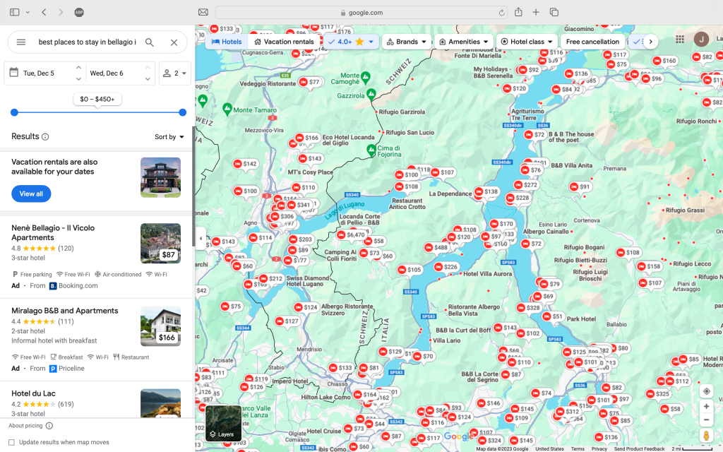
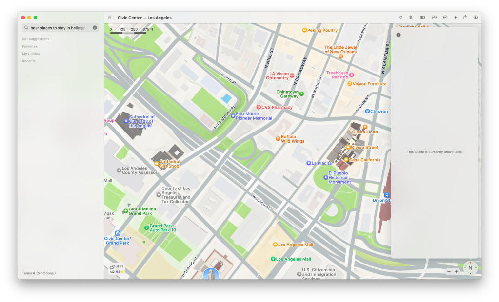
“best places to stay in bellagio in may”
Google Maps response:
- Gets me to the right region (Lake Como), but not Bellagio
- Is clever enough to show hotel prices
- Fails on timeframe: shows December instead of May
Apple Maps response:
- Hmm.
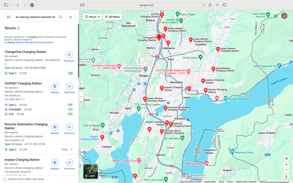
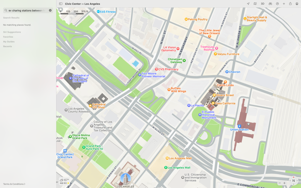
“ev charging stations between home and phoenix”
Google Maps response:
- For some reason Google thinks I need to keep looking in Italy
Apple Maps response:
- Hmm.
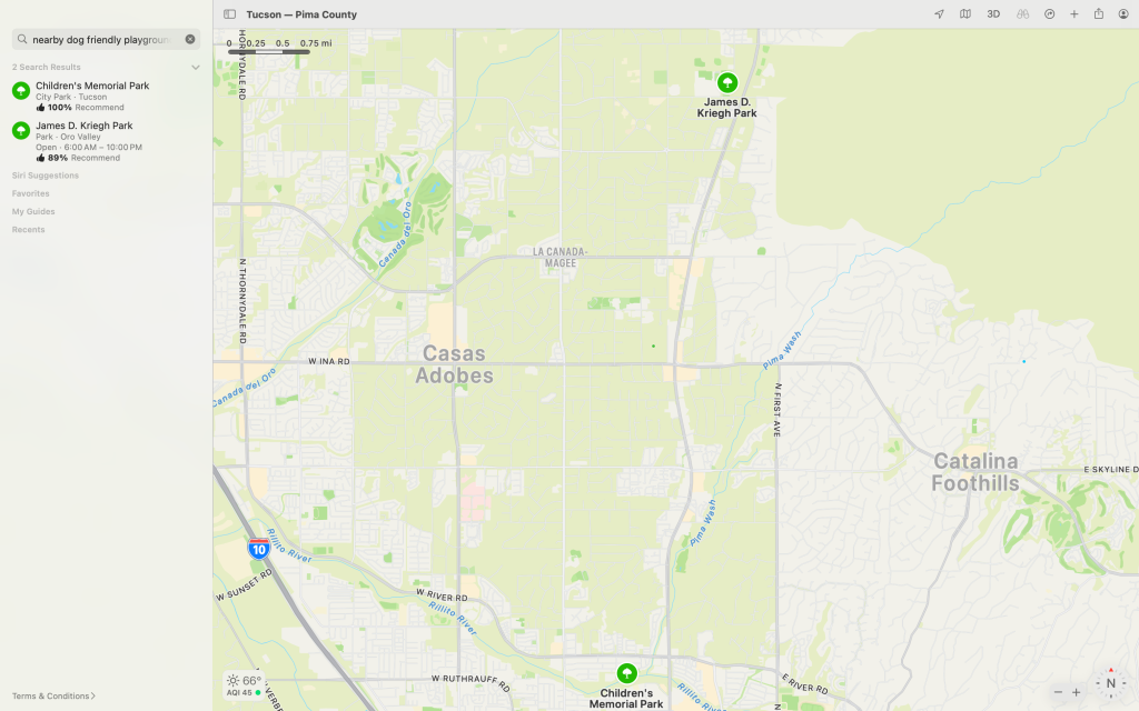
“nearby dog friendly playgrounds with swings”
Google Maps response:
- Gets the “dogs” bit from all the user comments
- Not sure about the swings though
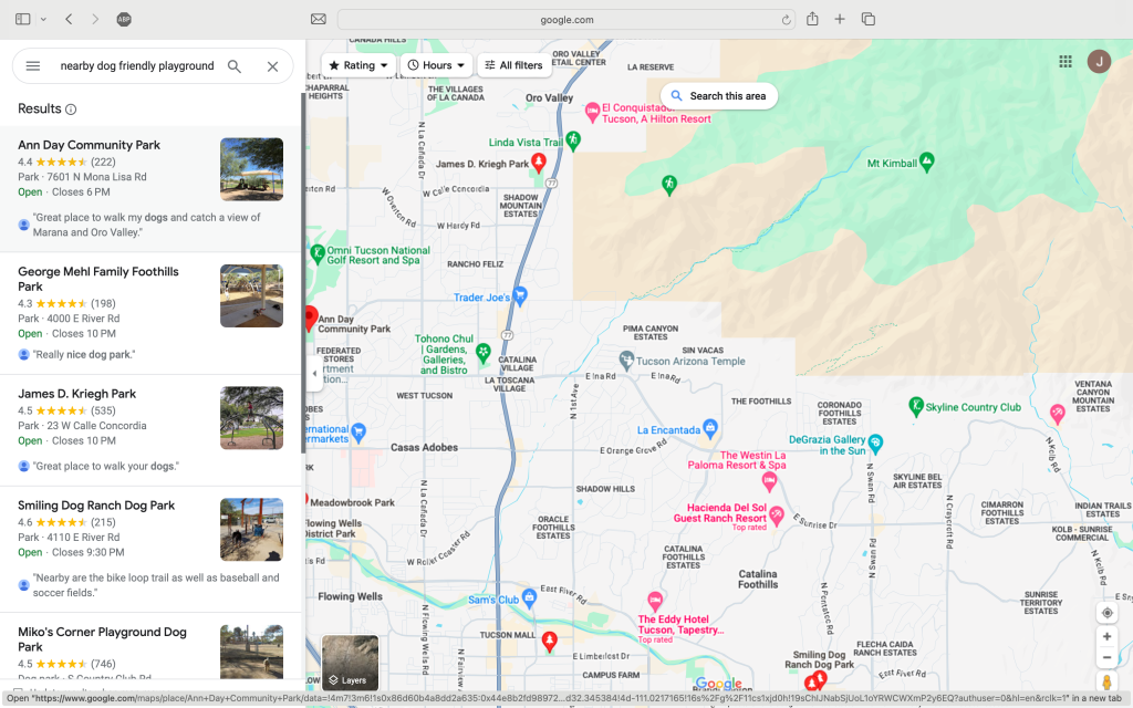
Apple Maps response:
- Assumes I’m looking for parks
- Ignores the question about dogs and swings
“places nearby to get good cheese”
Google Maps response:
- Does’t give me a list of possible stores and instead routes me to the nearest Trader Joe’s supermarket.
- I happen to shop at this store a lot and I bought some cheese there only a few days ago.
- I know Google is notorious for tracking everything you do, but really Google — do you have to be so creepy?
Apple Maps response:
- Yes. That really was the response. A conference center 100 miles from where I initiated the search.
Now you could argue that some of the [Google] answers are pretty good and it’s just the data that sucks. But I’m not going to let either provider off that easy.
Now that most of us are used to a conversational engine from the prodigal Uncle Sam 1 — and not only that — a conversational engine that can maintain context — the results that you get from both Google Maps and Apple Maps seem a little, let’s just say, “SAD!”
In today’s age of generative AI it doesn’t seem like an unreasonable demand to expect a somewhat more salient interface? So where is it? Well I wouldn’t be at all surprised if the little hamsters in Mountain View and Cupertino are working on it and we just haven’t seen it launched yet.
But wait — somebody already did! — no less than Amazon Web Services! Here’s there announcement via LinkedIn:
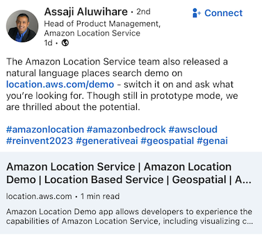
So let’s give it a try with the search term “coffee shops in tucson that serve great latte”:
Credit: AWS Well I know it’s beta software, but really AWS — surely you can do better than that?
Place ratings that don’t suck
Actually I’ve whinged 2 about this before. See “Why Rating Systems for Places & POIs Suck… and a Possible Fix“.
TL;DR: places that are highly rated commonly suck and vice versa. There’s a better way to do this.
Cool routes
So how many times have you set out on a road trip when you have time on your hands and you want to avoid the soul-sucking, mind-numbing, interesting-things-obfuscating, complete-and-utter-boringness of driving on motorways and freeways?
Ok, granted, there are one or two highways that are interesting — Interstate 80 over Donner Pass or the M6 through the Lake District come to mind — but the percentage of them that offer that luxury must be significantly less than the percentage of time people enjoy talking to the helpline of their interweb service provider.
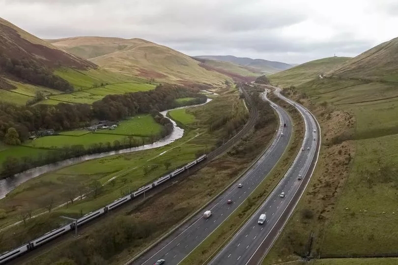
M6 Motorway through the Lake District in northern England — Image credit: Highways North West “Ah but!” I hear you say. “You can just select the ‘avoid highways’ option in your chosen navigation app”. Rubbish. That option is a cop-out that does no more than apply a brain dead algorithm that pretends freeways and motorways don’t exist. I guess if you like driving down frontage roads it’s a lovely feature.
Let’s instead talk about motorbikes.
Now, personally I have to agree with Jeremy Clarkson, I’ve never seen the point of motorbikes. But the people who are afflicted with a passion for riding these contraptions do have a point. They like good roads and they tend to hate freeways. What do they use to find good routes? They use alternate sources of information and one of them also happens to be one of my favorites.
It’s called MadMaps and I’ve used it countless times when looking for interesting routes to traverse California. But it ain’t integrated into your favorite mapping app. And nor does it have its own dedicated app. But if you want a cool route, it’ll give you one. I highly recommend it.
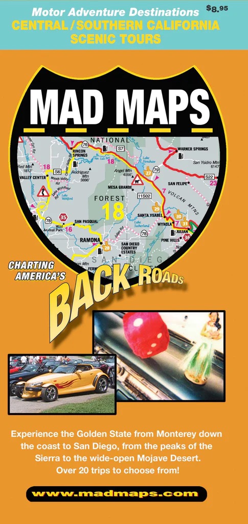
Please someone — license MadMaps’ data and other data like it— your users will love you for it. If you want a deeper dive on how it might be used, read this.
Cool routes with waypoints I might actually like
Ok. Now if you can get me on cool routes, now give me waypoints along the way that I might actually want to visit. This gets back to “Place ratings that don’t suck” but it also ties in to a requirement for creating a recommendation engine that doesn’t recommend crap and pays at least some scant attention to the things I do actually like.
Is it really that hard? 3
Least busy roads for cycling — no, I really mean that!
Now I may not have a passion for motorbikes, but I do have a passion for pedal powered bikes. I’m always on the look out for routes that are enjoyable to ride as well as being less likely to turn me into road pizza. If you happen to share my passion I’m pretty certain you also share the same goals.
Now my alma mater at Apple Maps has made some great strides in this area. Apple Maps now provides cycling directions across all of the USA, China, France, Germany, Japan and Australia as well as a number of big cities. What’s cool about it is that it allows you to avoid hills and busy roads.
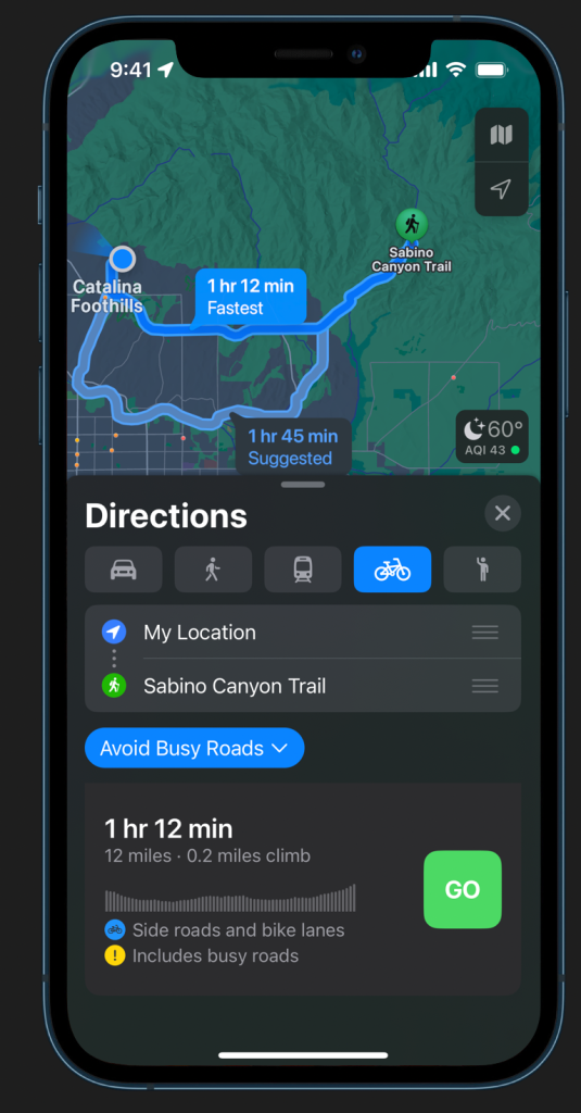
Only it doesn’t.
All too often it takes you down busy roads when there’s a perfectly good residential route that would be a much better alternative. So, Apple, more work to be done on your algorithms, perhaps? Like simply invert the hierarchy of road classification?
Here’s a simple example of cycling directions on Apple Maps where despite the ‘Avoid Busy Roads’ selection it does the very opposite and makes a beeline for the busiest possible road in the area:

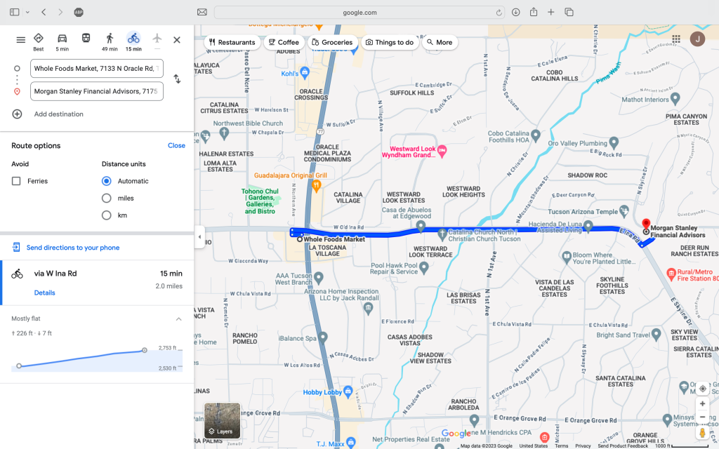
Example Cycling Route on Apple Maps Google Maps is no better. In fact it’s worse. As far as I can tell it doesn’t give you an option to avoid busy roads, it only gives you an option to avoid ferries. Hmm. That’s useful:
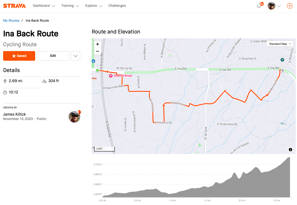
The same cycling route on Google Maps Now here’s my hand-curated preferred route to really avoid busy roads made in Strava. Believe me, if you value your life it’s the route to take:
The same route but this time hand-curated to really avoid busy roads — Credit: Strava Now get me parked…
So you’re off for your fun night out. Perhaps a restaurant, a play, a game or a concert. Jumping in your vehicle you set the destination in your favorite nav app and head off happily to your ‘final’ destination. Only when you arrive you’re not so happy.
It all results in the abrupt eruption of an unwelcome ‘anxiety’ — just one of countless anxieties we all seem to be increasingly burdened with living in the 21st century.
It’s not range anxiety. It’s not where-do-I-find-a-working-electric-plug anxiety. It’s not FOMO. And nor is it chronic-fear-of-environmental-doom-due-to-climate-change anxiety.
No, it’s something much more mundane. It’s “now-where-the-fuck-do-I-park?” anxiety (perhaps ‘WTF-DIP’?)
Navigation systems and apps do a reasonably good job of getting you to your destination, but they don’t make it easy to solve that age-old and vexing problem of where you should park.
Yeah, sure, I can try to remember to add an extra stop before I leave. Alternatively I can do a last minute on-the-fly search as I get close to my destination. But that’s a pain and it only adds to my stress.
The data is there — at least for off-street parking anyway. What’s missing is the UI.
Come on guys.
Please get me to the right building (and the right entrance!)
I’m guessing you’ve probably encountered this many times. Either in your car or when on foot.
You’re looking for that one business or office in a cluster of buildings, or you’re looking for that apartment but you don’t know which of the six buildings it’s in.
And you don’t know where to park closest.
And you don’t know which side of the building has the best entrance.
And it sucks.
‘Cos you waste endless time and energy circling and then you find you’ve got a fifteen minute walk in the pissing rain when it could have been two. Or you have to abort your mission, get back in your car and try again.
There are countless situations where this arises: apartment complexes, hospitals, stadiums, corporate headquarters, universities. Even the classic American strip mall.
Ok, so it’s not an easy problem to solve. But it still really sucks.
(But if you do own such a complex — try Mappedin Maker — you can create and publish a map of your facilities for your visitors in minutes — and it doesn’t cost a dime!)
Indoor maps everywhere — but personalized for me
Ok so let’s assume you can get me to the right building. Now what?
Yup. You need an indoor map.
And instead of sending me a PDF with general directions to the lab that you want me to go to — which I’ll promptly misplace — why don’t you just send me a link that gets me to the exact room I need to go to.
For example, maybe like a link like this?
Fewer immersive views and more maps please
By now you should be getting the picture. None of these asks are about a desire to recreate reality. Not one of them is about immersive experiences.
We’re all forgetting how gorgeous, useful and informative maps can be.
Maps that surprise and delight.
Most mapping apps have four maps at best: road, transit, traffic and satellite. And if you’re lucky may be an ‘explore’ or ‘bike’ map, but alas the current attempts at such maps leave a lot to be desired.
What about dedicated maps for other purposes?
Like a really good bike map? Or maps designed for visiting state and national parks? Or perhaps a set of maps that educate with information about population and demographics? Or perhaps administrative or political boundaries? How about voting districts? Or perhaps the economy?
Ok — so some of this is going beyond the traditional purview of a navigation app, but hey — isn’t that what these mapping apps want anyway? (See “The Underlying Angst of Google Maps and Apple Maps“.) 4
Alas, printed maps are almost dead. And I suspect it’s even worse for atlases. As a result the kinds of maps you were accustomed to seeing in such publications are quickly being forgotten too.
I’m convinced there’s an opportunity here.
Now if only someone would listen.
A mapping app my mother-in-law would use
I don’t know how many of you have a mother-in-law. I suspect there are one of two of you out there. I have one. She’s 89. For her age I have to admit she’s actually pretty with it as far as technology goes. At least in a limited manner anyway.
She can find her way around a macOS desktop. She can use the Mail app and get to Amazon and Facebook in the Safari browser.
But it pretty much ends there.
Try as we might we can’t get her to find her way around an iPhone. Instead she resorts to preferring her 1990s style flip phone. God knows why. I can barely use that thing. Have you tried sending text messages on a flip phone recently? It’s bloody complicated.
So it was with great excitement that I learned about a new feature in iOS 17 called “Assistive Access Mode”. When set up it essentially degrades your $1,000 investment into a cheap Jitterbug phone.

Image Credit: Journey Health & Lifestyle What?
Well, for some mother-in-laws at least this is a pretty good proposition because now the device is suddenly a lot less scary and a little more approachable.
Here’s what it looks like after the set up:
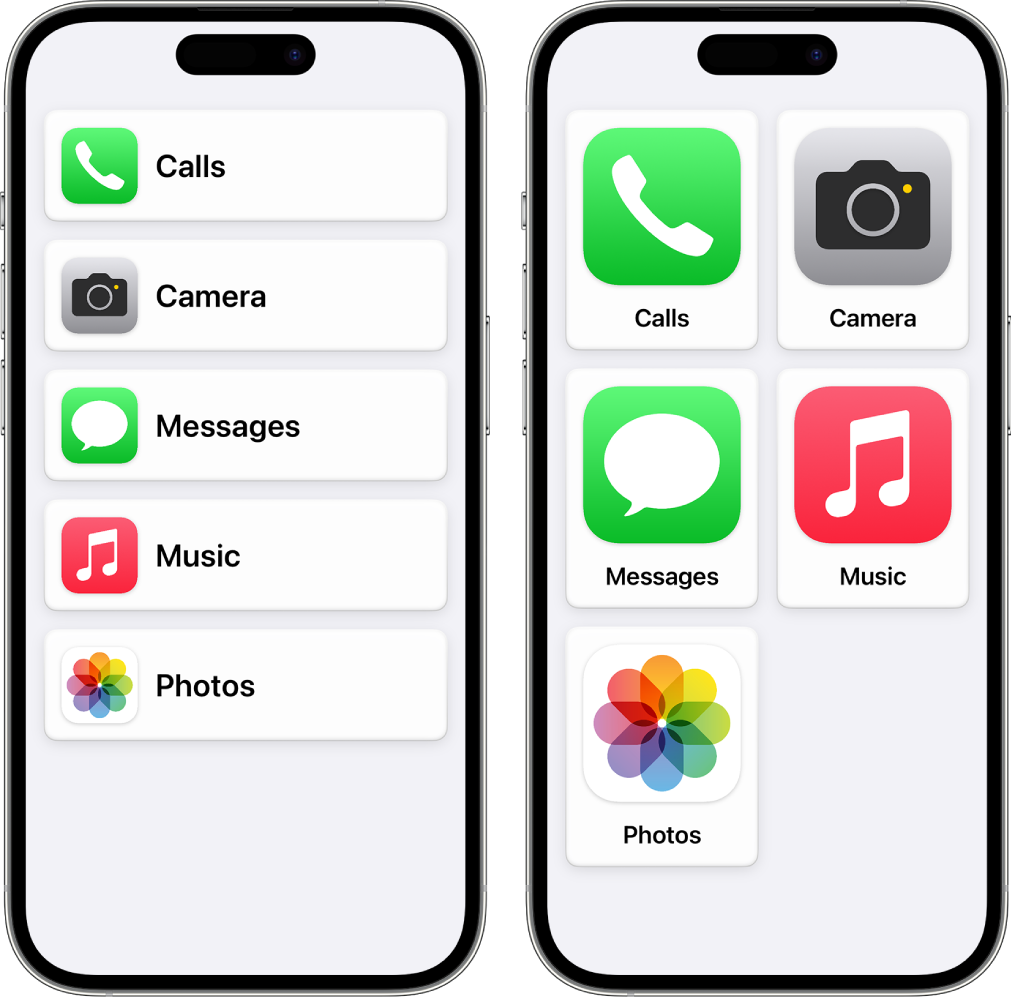
Assistive Access Mode in iOS 17 — Image Credit: Apple Did Apple nail it?
No, the interface actually still mostly sucks and it still scares the living daylights out of my mother-in-law. But hey, it’s a reasonably ok first effort.
Try adding the Maps app to the interface, however, and you’re on your own. All it does is embed the standard Maps app into a smaller screen space than would normally be allocated for the app.
In other words, it sucks so much that Steve is more than likely rolling in his grave.
There’s a market for making this easy. And UI designers should spend a lot more time learning from their mother-in-laws. We might all be in a better place.
TL;DR
Missive to the big boys: Forget immersive views. Create something more useful. It’ll cost you a lot less and your users might actually appreciate it.
That’s it for this week’s rizzy Map Happenings missive. Until the next time.
- Sam Altman that is. ↩︎
- A widely used British term that means “complained persistently and in a peevish or irritating way.” Oh and by the way — it’s pronounced “win-jing” ↩︎
- @Google: given you’re watching my cheese shopping so closely this should be a slam dunk for you. ↩︎
- BTW: did you notice that these apps are called “Google Maps” and “Apple Maps” — not “Google Directions” or “Apple Nav”. So don’t tell me you don’t have ‘permission’ to go broad. ↩︎
-
12 Map Happenings that Rocked our World: Part 6
The Advent of Computer Based Mapping
History is written by the victors.
So said Winston Churchill. Or at least he is said to have said it. Whether or not he actually said it is up for debate. The background story is a tad more complicated.
Regardless the quote is apropos to this week’s episode of Map Happenings.
If do you a little research on the advent of computer based mapping all roads appear to point in the same direction. And that direction seems to be towards an English chap who in 1933 was born in Cambridge (England — not Massachusetts you fool!) His name is Tomlinson, Dr. Roger Frank Tomlinson.

Dr. Roger Frank Tomlinson (1933-2014) — Credit: Wikimedia As many of you mapping nerds will know it is Roger who has been anointed the “Father of GIS”. If you’re not a mapping nerd then you may be wondering what that particular TLA1 stands for. The answer is “Geographic Information System”.
According to Encyclopedia Brittanica (yes, it still exists) an information system is “an integrated set of components for collecting, storing, and processing data and for providing information, knowledge, and digital products”. According to the National Institute of Standards and Technology (NIST, part of the U.S. Department of Commerce) the definition for an information system are many, but probably the most succinct is “A discrete set of resources organized for the collection, processing, maintenance, use, sharing, dissemination, or disposition of information”.
One of the first mechanical information systems was the tabulator that Herman Hollerith invented to process the results of the 1890 U.S. Census. His invention came as a result of a competition the U.S. Census Bureau held in 1888 to find a more efficient method to process and tabulate census data. Hollerith won.
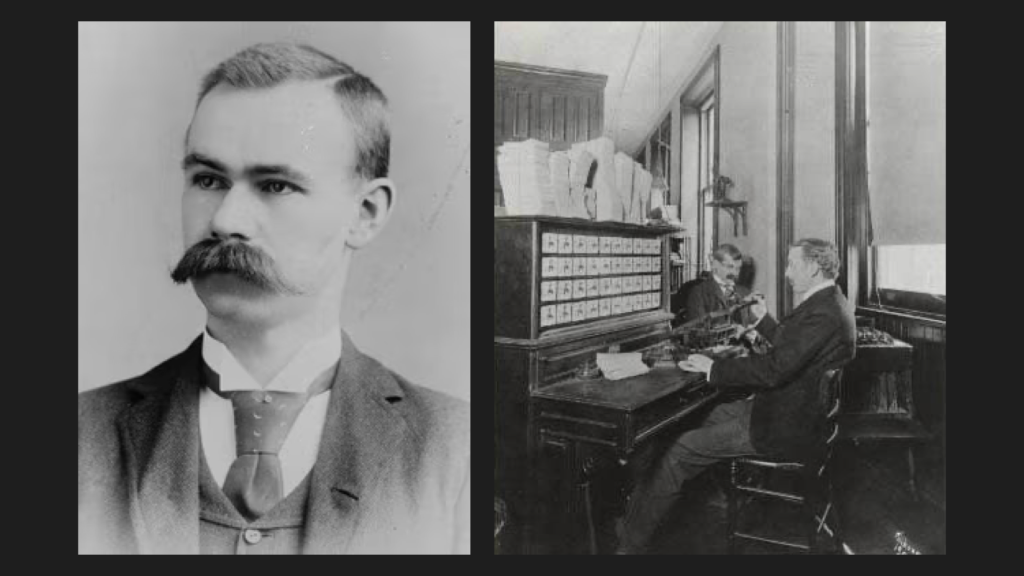
Hollerith (1860-1929) and his Tabulator (1902 version depicted) — Credit: U.S. Census Bureau This mechanical marvelry continued to evolve and be employed for processing census data for five decades, right up until 1940. Then in 1943 the U.S. National Defense Research Council (NDRC) approved the design and construction of the Electronic Numeric Integrator and Computer (ENIAC). It was during the development of ENIAC that the Census Bureau started to explore the use of the technology for their own purposes. The final result of this study were specifications for the Universal Automatic Computer (UNIVAC).
For a computer nerd like me I find the story fascinating. Here’s the history as described by the U.S. Census Bureau:
UNIVAC was, effectively, an updated version of ENIAC. Data could be input using magnetic computer tape (and, by the early 1950’s, punch cards). It was tabulated using vacuum tubes and state-of-the-art circuits then either printed out or stored on more magnetic tape.
UNIVAC I [was built] in 1948 and a contract for the machine was signed by the Census Bureau on March 31, 1951, and a dedication ceremony was held in June of that year. UNIVAC I was soon used to tabulate part of the 1950 population census and the entire 1954 economic census. Throughout the 1950’s, UNIVAC also played a key role in several monthly economic surveys. The computer excelled at working with the repetitive but intricate mathematics involved in weighting and sampling for these surveys.
UNIVAC I, as the first successful civilian computer, was a key part of the dawn of the computer age. Despite early delays, the UNIVAC program at the Census Bureau was a great success.
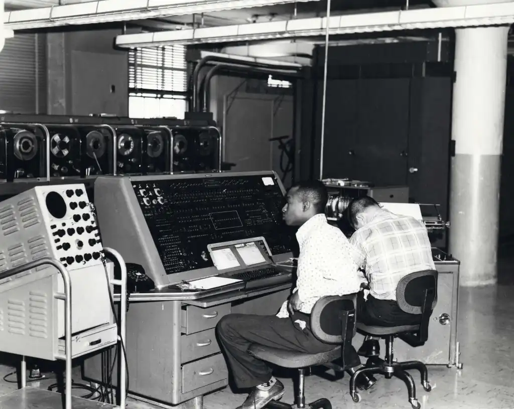
UNIVAC Computer at the U.S. Census Bureau – c.1960 — Credit: U.S. Census Bureau I have to say, kudos to the U.S. Census Bureau. Time and time again they have shown their prowess with technology and with mapping systems. Their work was pioneering in many ways I’d frankly I’m surprised that they didn’t beat the rest of the world to inventing the world’s first geographic information system.
But there again, it’s back to “history is written by the victors”.
And so it’s back to old Roger.
In 1951 Roger started his career as a pilot in the Royal Air Force, but at 6’7″ (2m) was promptly warned he was too tall for the ejector seats. Should he have been ejected his legs would have been left behind. Rather than run the risk of becoming legless he instead chose academics. Having now seen a great deal of geography from the air, he opted for a degree in geography on the ground at the University of Nottingham in England. Later the offer of a scholarship from McGill University in the land of frozen tundra enticed him to Canada where he pretty much stayed for the rest of his life.2
But it was his job at Spartan Air Services in 1960 where the lightbulb went off. In Roger’s own words:
“In 1960, Spartan Air Services of Ottawa, Canada, was a large surveying and mapping company whose business included topographic mapping, geophysical surveys, land resources surveys, and other projects worldwide. […] George Brown, chief of Spartan’s land resources division, permitted me to try digital methods as a potentially cost-effective alternative. I created two small test maps in numerical coordinate form-each 5 x 5 inches and containing five polygons. I found that these could be digitally overlaid and that I could measure the resulting areas from the digital record. Efforts to interest Ottawa computer companies (Computing Devices of Canada, IBM, Sperry, and Univac) to partner with Spartan for future development were not successful. However, in 1962, at an ASPRS conference in Washington, DC, John Sharp, a consultant to IBM, introduced Spartan to the digital photogrammetric research being done at IBM in Poughkeepsie, New York, in the United States. That, along with subsequent contacts with the previously reluctant staff in the IBM office in Ottawa, was the beginning of a pivotal relationship that was to grow significantly over the years. IBM brought early experience with computers and programming to the table. I brought an understanding of the needs, as well as the geographical training needed to formulate the new concepts and to spell out the requirements for the system.”
And so, history tells us that it was in 1960 that the use of computers for geography was born.
But of course it didn’t stop there.
While on a flight in 1962 Roger struck up a conversation with the person seated next to him. That person turned out to be Lee Pratt who was the freshly appointed head of the Canada Land Inventory. Roger wasted no time preaching the early gospel of GIS to Lee and it all eventually led to the founding of GIS’s first church: the Canadian Geographic Information System (CGIS).
Meanwhile another victor was vying for history…
In 1963 a gentleman from Harvard, one Howard Fisher, got involved. He happened to have attended a talk by Professor Edgar Horwood of the University of Washington on computer mapping. Horwood was an urban planner, a pioneer and very much an unsung hero. For you extreme mapping nerds: he also founded URISA.
Fisher saw what Horwood was doing and thought he could do better.
In 1965 Fisher convinced the Ford Foundation to issue a $294,000 grant to Harvard to found the Harvard Laboratory for Computer Graphics and anoint him as its Director. It was at this freshly minted lab that work on the Synagraphic Mapping System (SYMAP) was started. SYMAP claimed to be the first computer based mapping system that integrated geospatial analytics. But it was based on line printer technology.
“WTF is a line printer?” I hear you young ‘uns ask.
Well if you’re of that ilk and are curious to know: it is a printer that can print only characters, A-Za-z0-9 and maybe the odd symbol — but no emojis — one line at a time. No vectors. No arbitrary scribbles. No HD anything. Hell, it wasn’t even as advanced as a dot-matrix printer you’ll maybe see occasionally at one of those super advanced computer terminals that airlines insist on using.
So how the truck do you output a map with one of these contraptions? The answer is by controlling how and when the printer advanced to the next line and by a method of overprinting — i.e. printing on top of letters that had already been printed. In that way many different and glorious shades of black could be achieved.
The output from SYMAP looked like this:
A SYMAP Map — Credit: Harvard Each of these outputs was derived from a computer ‘job’ that ran in batch mode. This meant your program was run by a computer operator wearing a white coat who lived in a room full of hot wardrobes that together comprised the computer. Your program was input using a stack of 80 columns cards with holes punched in them, all held together with an elastic band. Upon submitting your job to these high priest operators you were lucky if you got your printout in less than four hours. And that was if you didn’t have an error in your programming. Sometimes it would take dozens of submissions to work out the bugs, thus implying weeks before you got the results you were looking for.
But it was out of this lab that a number of companies were spawned. You may have heard of one of them: Esri. Or Environmental Systems Research Institute as it was initially known. At that time its founder, Jack Dangermond, was just a wee lad and was exploring digital mapping at the University of Minnesota. It was while he was at this university that he discovered an article about the Harvard lab and decided he must visit.
It turn out to be rather like the story of Jobs visiting Xerox Parc.
While at the lab Jack met Howard Fisher. Impressed by Jack’s work Howard spent the afternoon telling Jack about the Lab’s work — all while Jack’s wife, Laura, waited patiently in the car. “You’ve just got to work here!” Howard exclaimed, and so he did.
You can hear Jack tell the tale in this 6 minute video:
Jack Dangermond talks about the Harvard Laboratory for Computer Graphics and Spatial Analysis: Interview by Nick Chrisman I think it’s interesting to note that if you look at the early history of using computers for mapping it was very different from other media revolutions. Take the transition from radio to TV for example. When it first came out broadcasters took a while to adjust to the new medium — early TV shows were simply modeled after radio broadcasts. It took a while to figure out that TV enabled entirely new kinds of programming.
You’d think it would have been the same with computer based mapping — i.e. computer programs would initially just be used to make printed map making more efficient. This obviously occurred (and still happens today). But due to the forethought and bright mind of Dr. Roger Tomlinson it was actually computer based analysis that took pole position.
Take Roger’s paper from 1962 for example, “Computer Mapping: An Introduction to the Use of Electronic Computers In the Storage, Compilation and Assessment of Natural and Economic Data for the Evaluation of Marginal Lands“. In this paper, Roger makes the case for using computer based spatial analysis for figuring out the best use for less than fertile lands across Canada. So right from the get-go Roger caught on to the amazing promise of geospatial analytics.
The Harvard lab cottoned on too. Three years after its original founding in 1968 they renamed the lab from “The Harvard Laboratory for Graphics” to “The Harvard Laboratory for Graphics and Spatial Analysis”. No mention of ‘geo’ yet, but they were getting closer.
As I said at the start, history is told mainly by the victors. Esri, the global powerhouse of commercial mapping technology, has taken the lead in giving reverence to Tomlinson and the Harvard lab. And rightly so.
But it all makes me wonder… was there another researcher somewhere around the world who was thinking along the same lines? Did she or he have the foresight to realize the immense possibilities of what computers could bring to mapping and geospatial analytics? But did they lack the funding, the resources or the recognition? Professor Horwood is certainly one chap who deserves more credit.
The untold history may remain forever a mystery.
Footnotes
1 Three letter acronym
2 The exception was that in 1974 Roger Tomlinson got his doctorate from University College London
Acknowledgments and References
- “Charting the Unknown: How Computer Mapping at Harvard Became GIS” by Nick Chrisman
- “Beginnings of Geodesign: A Personal Historical Perspective” by Carl Steinitz
- “How Advances in Computer Mapping Shaped the Early Days of GIS” by Greg Bruce
- History of URISA — URISA
- Roger Tomlinson Obituary
- “The Hollerith Machine” – U.S. Census Bureau
- “Roger Tomlinson – The Father of Computerized Cartography“by Rick Boychuk, The Globe and Mail
- “In Memoriam: Roger Tomlinson – “The Father of GIS” and the transition to computerized geographic information.” — Photogrammetric Engineering and Remote Sensing Magazine, May 2014
-
Apple Maps – is Something Big Cooking?
Having followed (and worked on) the Apple Maps team for eons I’m always intrigued by the pace of Maps releases. Apple effectively has four versions of the Maps app: one for iPhone and iPad, one for Mac, one for Watch and one for CarPlay. As with many home grown Apple apps most of attention goes into the iOS version, although for Maps we’ve started to see more particular attention being paid to CarPlay and Watch.
But if you happen to be anally retentive like me and take your time to dig into the iOS releases of Maps since 2012 you’ll find that the pace of announcements has been positively stuttered:
For the gory details scroll down to the footnotes ‘User Impact’ indicates Yours Truly’s opinion on how much the new features affect users, from the apoplectic horror of Maps in iOS 6 to the surprise and delight of the ‘detailed city experiences’ in iOS 15. If you squint at the table above you might start to note a bit of a pattern: a big, impactful announcement generally followed by a couple of years of lull followed by another big announcement.
The last big, impactful announcement was two years ago with the launch of ‘detailed city experiences’:
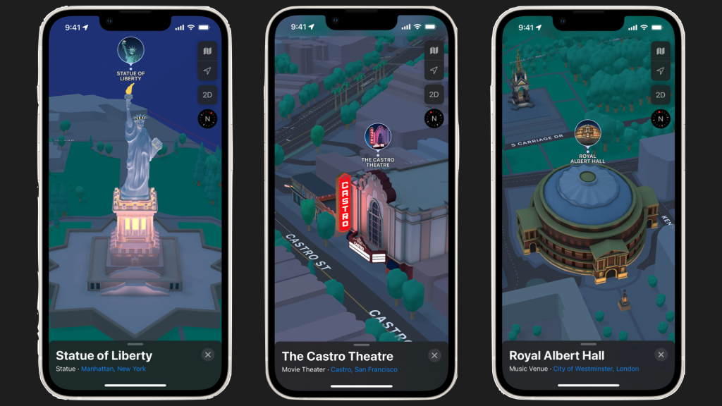
So perhaps we should prepare ourselves for the next big thing?
I’m willing to bet one of you a dollar that it’s going to be something to do with that newly re-fangled concept that Apple has been plugging: ‘Spatial Computing’.

Some niggly feeling inside me suspects that the next big release of Maps will be for Vision Pro — and it will blow all other mapping experiences out of the water.
I can’t wait to see what comes out of the oven.
Footnotes
Apple Maps features as announced in Apple press releases for iOS:
For iOS 6 in 2012:
iOS 6 includes an all new Maps app with vector-based map elements that make graphics and text smooth, and panning, tilting and zooming incredibly fluid. New turn-by-turn navigation guides you to your destination with spoken directions, and the amazing Flyover feature has photo-realistic interactive 3D views. Real-time traffic information keeps you updated on how long it will take to get to your destination and offers alternate time-saving routes if traffic conditions change significantly. Additionally, local search includes information for over 100 million businesses with info cards that offer Yelp ratings, reviews, available deals and photos.
For iOS 7 in 2013:
Night Mode in Maps that responds to ambient light when you use it in the dark
For iOS 8 in 2014: no mention of Maps
For iOS 9 in 2015:
In iOS 9, Maps adds support for metropolitan transit systems and schedules, and subway station entrances and exits are precisely mapped, providing every step of your trip. When you plan your trip, Maps can offer a combination of trains, subways, buses and walking, and with the new Nearby feature, quickly see what’s around by searching for food, drinks, shopping and more.
For iOS 10 in 2016:
Maps in iOS 10 gets a beautiful redesign that makes it even simpler and more intuitive to use. Now open to developers with new extensions, apps like OpenTable can integrate bookings right into Maps, and services like Uber and Lyft can make it easier for users to book a ride, without ever leaving the Maps app. Maps is even smarter with new intelligence that proactively delivers directions to where you most likely want to go next, based on your routine or appointments on your calendar. Once a route is planned, Maps can search along the route for gas stations, restaurants, coffee shops and more and provides an estimate of how the stop impacts the length of your trip.
For iOS 11 in 2017:
Apple Maps adds indoor maps for major airports and shopping centers around the world and lane guidance to avoid missing a turn or exit.
For iOS 12 in 2018: no mention of Maps
For iOS 13 in 2019:
All-New Maps Experience
Apple Maps helps millions of people navigate and explore the world, all while protecting user privacy. After driving 4 million miles to rebuild the basemap from the ground up, Apple is delivering a new Maps experience with broader road coverage, better pedestrian data, more precise addresses and more detailed landcover. The new map is available now in select cities and states, and will roll out across the US by the end of 2019 and to more countries in 2020.
Powered by the new basemap and high-resolution 3D photography, a new Look Around feature delivers beautiful street-level imagery of a city with smooth and seamless transitions. iOS 13 brings additional new features to the Maps app, including Collections to easily share favorite restaurants, travel destinations or places to shop with friends, and Favorites for navigating to frequent destinations, such as home, work, the gym or school, with a simple tap from the launch screen.
For iOS 14 in 2020:
Greener Ways to Explore and New Guides in Maps
Maps makes it easier than ever to navigate and explore with new cycling directions, electric vehicle routing, and curated Guides. Cycling directions take into account elevation, how busy a street is, and whether there are stairs along the route. Electric vehicle routing adds charging stops along a planned route based on current vehicle charge and charger types.2 Guides provide a curated list of interesting places to visit in a city, created by a selection of trusted resources. Guides are a great way to discover hot new restaurants, find popular attractions, and explore new recommendations from respected brands, including AllTrails, Complex, The Infatuation, Time Out Group, and The Washington Post, among others.
For iOS 15 in 2021:
Explore the World with Apple Maps
Apple is committed to building the world’s best map, and iOS 15 takes Maps even further with brand new ways to navigate and explore. Users will experience significantly enhanced details in cities for neighborhoods, commercial districts, elevation, and buildings, new road colors and labels, custom-designed landmarks, and a new night-time mode with a moonlit glow. This is a whole new way of looking at the world through Maps.
When navigating using iPhone or CarPlay, Maps features a three-dimensional city-driving experience with new road details that help users better see and understand important details like turn lanes, medians, bike lanes, and pedestrian crosswalks. Transit riders can find nearby stations more easily and pin favorite lines. Maps automatically follows along with a selected transit route, notifying users when it’s nearly time to disembark, and riders can even keep track on Apple Watch. With iOS 15, users can simply hold up iPhone, and Maps generates a highly accurate position to deliver detailed walking directions in augmented reality.
For iOS 16 in 2022:
Apple Maps is introducing multistop routing, so users can plan up to 15 stops in advance and automatically sync routes from Mac to iPhone when they’re ready to go. Maps is also bringing transit updates to users, making it easy for riders to view how much their journey will cost, add transit cards to Wallet, see low balances, and replenish transit cards, all without leaving Maps.
For iOS 17 in 2023:
Maps adds offline maps, so users can download a specific area and access turn-by-turn navigation, see their estimated time of arrival, find places in Maps, and more while offline. Maps also makes it easier than ever to discover thousands of trails in parks across the United States, and supports electric vehicle drivers with real-time charging availability information.
-
Wam. Bam. Instant Indoor Maps.
So back in August last year I wrote a post on the subject “Tsunami Warning: Indoor Maps“. In it I opined that for the last 30-40 years the mapping world has been missing something.
99% of the attention has been on mapping the outdoors and scant little attention has been paid to mapping indoors. As a consequence if you look at practically any popular map you’ll see it is peppered with little black holes — those black holes representing the many millions of building footprints around the world.
And the boundary of every building footprint is like its own little event horizon: dare to cross the threshold and practically all information is seemingly lost.

Downtown New York in Google Maps — awash with yellow black holes with little or no information 
The same area in Apple Maps — you could argue the map looks more attractive, but it’s still awash with black holes So why bother with indoor maps in the first place?
Well please humo[u]r me for a moment while I posit this conjecture:
I put it to you that in just a few years not having an indoor map of your buildings or facilities will be like not having a high speed data connection. Just like outdoor maps play a vital role, these smart and interactive indoor maps will bring their own unique value, providing:
- Building layouts and indoor directions for visitors and staff
- Invaluable life saving information for first responders
- Critical information to enable highly efficient building operations & facilities maintenance
- A platform for a whole new category of software: indoor analytics — so you can optimize everything going on inside your facilities — e.g. for resource placement, energy consumption or cost management.
So if that’s the case, why don’t we see an abundance of interactive indoor maps?
Well truth be told, creating an indoor map isn’t easy. Take it from me — I was intimately involved with the indoor mapping program at Apple Maps for many years. We learned — the hard way — that making indoor maps is no piece of cake. It’s actually at least two pieces of cake, if not a whole tower of cakes.
The main cost and complexity is involved with converting building floorplans from the format known and loved by building architects — typically something called ‘CAD’ files and more recently ‘BIM’ files — to a geospatial format. Commonly it has generally meant digitizing floorpans using overly complex geospatial tools that are expensive, hard to learn and even harder to master.
And once you had laboriously created your indoor map it was generally another mountain of work to publish it and share it with others.
And — if you wanted indoor navigation with that — ha! That involved a whole other set of challenges requiring even more machination and grinding of teeth.
So, it’s hard, really hard.
That is up until now.
For about the last 6 years I’ve been following a little company that’s been active in this space and I’ve always been impressed by their work. So much so – full disclosure – back in January I happily accepted their invitation to join their board.
Their name is Mappedin and this week they announced something that is really quite groundbreaking and — to borrow from Apple’s parlance — I think you’re going to love it.
It’s called ‘Maker’.
Maker allows you to take a floorplan and in just a few minutes create an interactive map from it. And with just one more click you can share it with others. But it’s not just an interactive map. The map automatically includes indoor directions.
And here’s the kicker:
‘Maker’ is free.
Yup. You heard that right.
So now any organization can create a map of their building in minutes and publish it as they see fit for the benefit of others.
The process is quite easy:
- Visit Mappedin.com and register
- Drag in your floorplans (e.g. from squared-up photos of the evacuation maps already displayed in your building)
- Locate the floorplan on a street map and align it with the building outline
- Using Maker’s intuitive web interface, digitize the floorplans or try Mappedin’s “Beta” version of “AutoMap”1
- Click the “Preview” button to experience the interactive map before you publish it
- When you’re happy, share the link or embed the map in your site
Here’s how you place the floorplan on the map:
Mappedin Maker: Aligning your floorplan to the real world is super easy This is what a floorplan looks like in Maker after you’ve uploaded it and before you’ve made it into an interactive map:
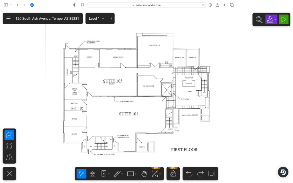
And this is after it has been digitized using Maker’s ‘AutoMap’ feature and about 5-10 minutes of further tweaking:
And this is previewing the interactive map before publishing:
And here’s a video of the published map in action, complete with indoor directions:
I would have embedded the interactive map in this page, but the folks at WordPress want an extra $300 per year from me for the privilege. Instead I’ll have to trouble you to click on a link: you can view the exact same interactive map here.
One cool hidden extra, when you share a link of a Mappedin map with someone, Maker is smart enough to maintain the state of the map. Here’s an example of sharing the same map above just after getting directions from the lobby to the conference room.
So here we are in 2023 and despite what I said on September 14, it turns out map making can be easy after all. 😱
Of course you’ll have to draw your own conclusions, but I would have to say that Mappedin’s Maker is the bee’s knees2 of indoor mapping platforms.
- Providing you start with a reasonably high resolution floor plan with decent contrast this will auto-digitize the floor plan. Given it uses AI and machine learning, Mappedin expects it to get better with time. ↩︎
- “The Bee’s Knees” is actually a Prohibition-era cocktail made with gin, fresh lemon juice, and honey. It is served shaken and chilled, often with a lemon twist. The name comes from Prohibition-era slang meaning “the best”. When describing something that is “the best” the British prefer to use the term “The Dog’s Bollocks”. That particular term comes from the not uncommon habit of male dogs licking their testicles (a.k.a. bollocks) — the theory being that they must be good as they spend so much time performing this act. So you could either call Mappedin’s Maker “The Bee’s Knees” or “The Dog’s Bollocks”. Either one works just as well. ↩︎
-
Yours Truly on “Minds Behind Maps”
Well it’s not often I get interviewed. It’s also very seldom that I pay compliments to anyone suffering from Frenchness. But today, dear readers, both are true.
Very recently I had the pleasure of being interviewed by the esteemed Maxime Lenormand for his excellent podcast, “Minds Behind Maps”. Somehow through expert and assiduous editing he even managed to make me sound somewhat coherent.
Together we cover a lot of topics including the history of in-vehicle navigation systems, the dawn of internet mapping and lots of juicy gossiping about Google Maps and Apple Maps.
So, if you’re prepared to flagellate yourself for a couple of hours you might consider subjecting yourself to listening to or watching the podcast. It’s available on all the usual platforms:
Also, if you’d like to listen to some other (likely much more interesting) episodes I suggest you browse the site: Minds Behind Maps.
Enjoy!
-
It’s 2023. So Why Isn’t Map Making Easy?
This jaded mapping curmudgeon has been in the industry a good few years and as a result has witnessed a few mapping epochs — the dawn of global digital street maps, the dawn of internet mapping and the dawn of mobile mapping to name just a few.
Coupled with that I’ve seen the tools to make maps evolve too. Back when I was a wee spotty-faced lad there were no off-the-shelf software products that could be used to create maps bigger than a postage stamp. So you had no other option but to write your own map editing software.
This stayed the same way for decades and is still much the case today. Those serious about creating a global map have continued to develop their own map editing tools1 Meanwhile off-the-shelf map making tools have lurched forward glacially. People publishing paper maps commonly used Adobe Illustrator to create their masterpieces. Individuals that had a desire to flagellate themselves with more insidious tools used offerings from the likes of Esri, Intergraph and Smallworld. Here you had to spend copious amounts of time and energy learning about an insanely long list of things like feature layer views, integrated mesh layers and composite relationships. Yes, dear readers, these are the tools for true mapping “professionals” and not for the feint of heart.
So to use a Jobsianesque term, what about “Mapping for the Rest of Us?”
Behold: “The Simple Map Happenings Challenge”
So to answer this question of “Mapping for the Rest of Us” let me propose “The Simple Map Happenings Challenge”.
It comprises two parts involving the creation of two very basic maps:
- Part 1: A map that shows the location of a bunch of addresses
- Part 2: A color coded map that shows sales by US states
It’s 2023, so you’d think this would be easy, eh?
Well let’s have a little poke around shall we?
Esri
These are the big boys in the mapping tool industry. Similar to Adobe in the desktop publishing world, Esri has basically bludgeoned every other significant competitor into oblivion. And they’ve made some great efforts to try to make their software easy. So let’s give their stuff a whirl.
I’ll start at Esri.com and see where it takes me:
Hmm. “Easily create web apps for any workflow with app builders”. Not what I’m looking for. Like most people only the planet nowadays when I need to find something I don’t waste my valuable time poking around on web pages. Instead I start with a search. So let’s do that shall we?
My attempts to search for “make a map” are immediately thwarted. At Esri apparently I’m only allowed to search for “make a mao”. Oh well, let’s see where it takes me:
Hmm, a blog about “: Make better maps” or how to make maps of Panama or seafloor maps still aren’t exactly what I’m looking for. Perhaps I’ll have to resort to a dreaded page crawl. Let’s look at the Esri product page:
Eureka! There it is! Something called “Mapping”. That looks very promising. Let’s dive deeper:
Bingo. “Mapping. Software to visualize and understand your data spatially”. And boy, look at those beautiful map illustrations! I’m now ravenous to dive in. Alas, I quickly become disillusioned and depressed. Scrolling down this page all I can find is information about what the software can do and a few interactive examples. Nowhere can I find a link to make my own map.
But then, I suddenly notice I missed what seems to be a possibly perfect tab: “Smart Mapping”. And it comes with a similarly perfect promise: “Quickly create beautiful and informative maps”
Could this finally be what I’m looking for?
I scroll down the page with bated breath. Finally I get to it … “Start mapping and understanding your data”. Yay!

But wait. What is this “Cloud-based SaaS” and “Infrastructure you manage” and “Developer tools”? I just want to map my addresses and show my sales by region. None of those options seem like the ticket. After further doom scrolling a bit further I get to …

Really Esri? You want me to talk to a salesperson? I’m sorry, but that’s not really today’s way of doing business. I think I’ll have to move on to other options 2.
Google
So the folks at Google have been mapping for a while. I think they’ve been doing it long enough to qualify as a mapping organization, don’t you?
Their namesake product doesn’t allow you to create maps, but googling “make a map” quickly directs you to Google’s My Maps product:
Looks promising! Let’s get started:
Ooh! A simple “Create a New Map” button! Let’s click and see what happens…
A somewhat tiny invitation to “import” data. Ok. I think I get it. Let’s try that:
Hey it’s seeing my little spreadsheet and asking me about columns to “position my placemarks”. Kudos for not using geographically insidious terms such as “geocoding”.
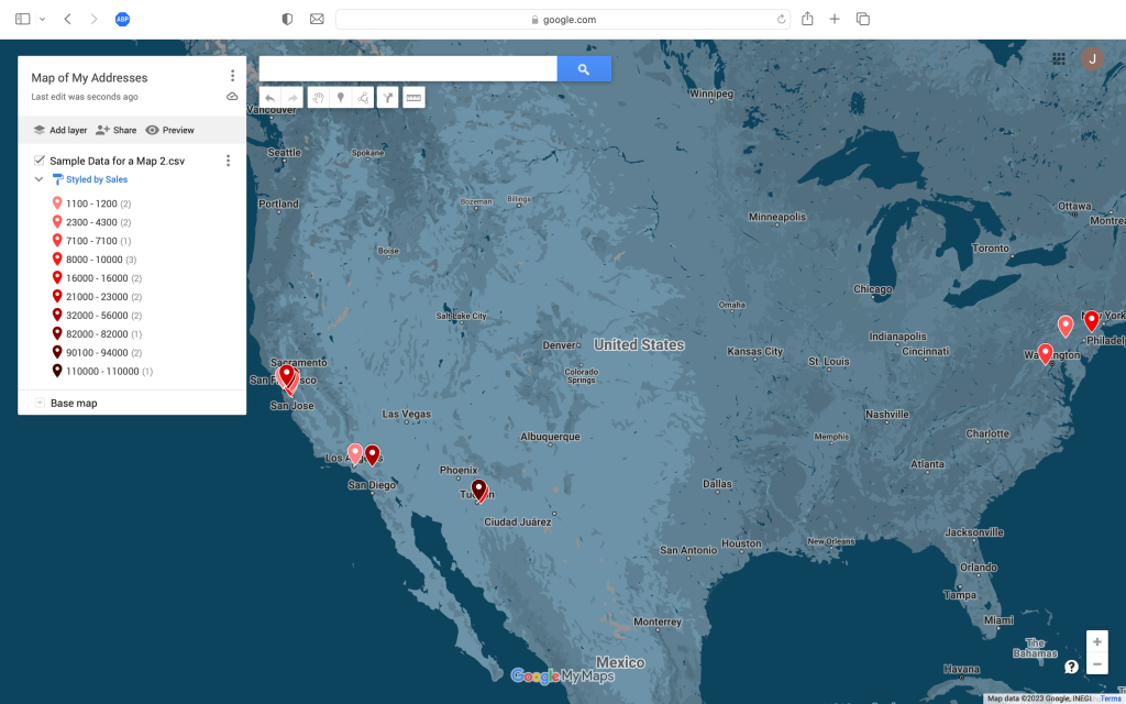
Moving on and with a little tweaking and not too much gnashing of teeth I get my map and I even manage to color code the pins by sales range. But alas, I fail Part 2 of the Simple Map Happenings Challenge: I can’t find a way to create a color coded map of my sales by US state. Grr.
Apple
Apple has “make a map” tools?!!
No, you’re right, it doesn’t.
Carry on…
Felt
Felt? Who the hell is Felt?
Well Felt, dear readers, is a newcomer to the scene. They have an entirely web based product that is aiming to take out all the complexity of mapping and make it super easy. Let’s take it for a spin:
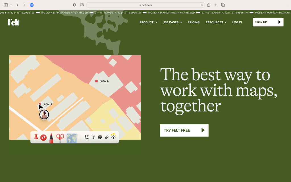
Here’s the main site. Now let’s try to see if it’s up to the Simple Map Happenings Challenge…
Ok — they give me some nice examples and there’s the “New Map” button. Let’s click it and see:
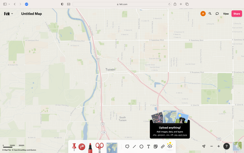
Ooh! Upload anything? That looks promising!
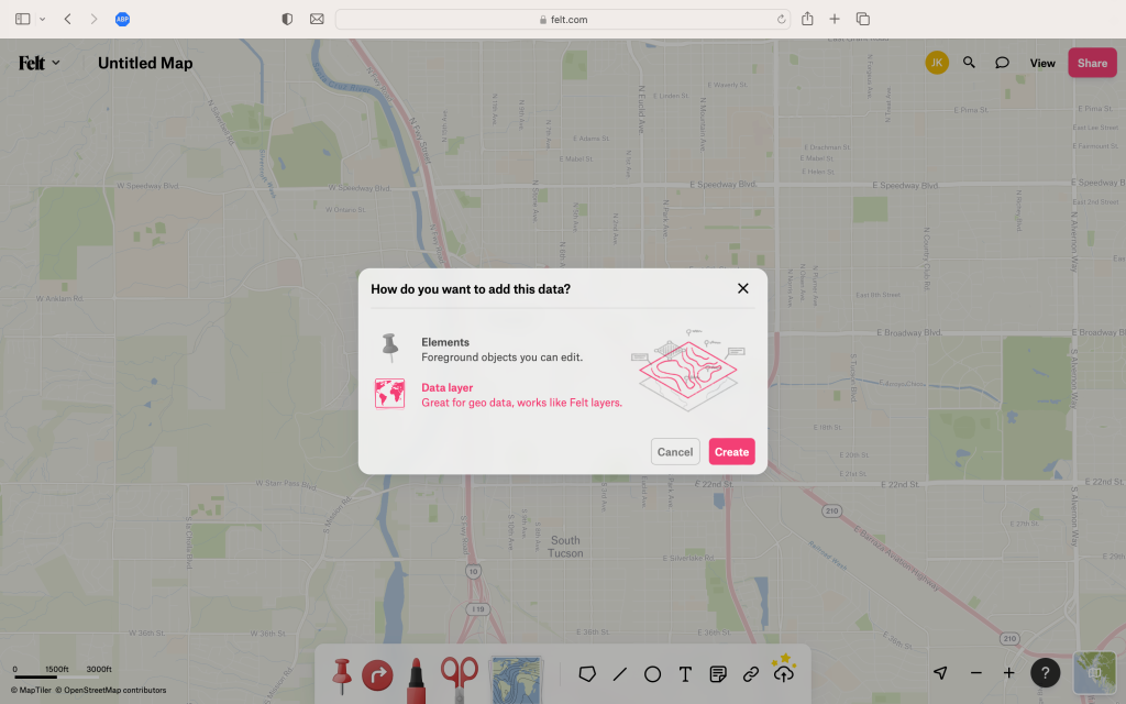
Hmm. Do I have “elements” or “data layers”. I’m not sure. Let’s try data layers…
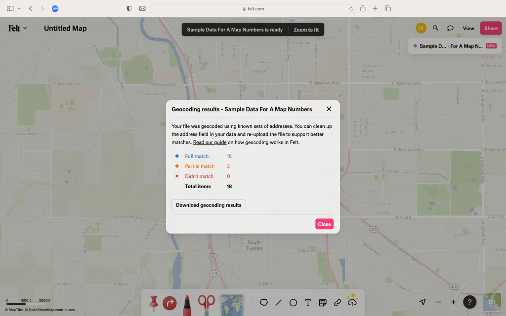
Uh oh. Felt can’t seem to find the location of three of the addresses. That’s weird, ‘cos Google had zero problems…
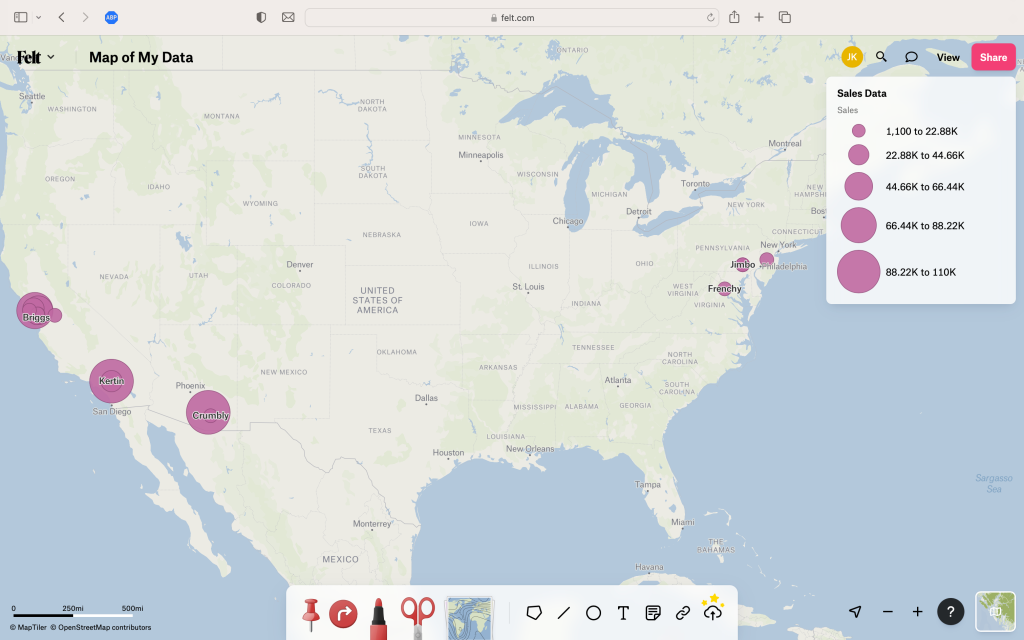
Well similar to Google I’m able to map the sales data, but this time I can make different sized circles based on sales volume. But surely there must be a way to create a color coded map by state? Let’s use help and search for it:
Well none of those answers look useful. Given all those sexy examples Felt showed, it must be possible to create what I want, but I can’t find it. Like many real customers might do… I’m going to give up and try something else.
Microsoft
Wait what? Microsoft does mapping?
Well it turns out they do, and they do it inside Excel. Sounds too good to be true, but let’s give it a try.
Here’s my little spreadsheet. If you look closely you’ll see something rather special embedded in the ‘Insert’ menu in Excel:
Whoa! Let’s try clicking it to see what happens:
Wow. It automatically figured out my data was for the US and created a legend for my sales. But whither my color coded sales by region map? For that I’ll have to do more poking.
After much jabbing I came upon a counterintuitive solution: if you hide the addresses — bingo — Microsoft (of all companies!) solves Part 2 of The Simple Map Happenings Challenge. It displayed a lovely color coded map of my sales by state.
But alas. It’s a pokey static map. I can’t pan it or zoom it. And where are the addresses? It doesn’t seem to know what to do with them.
In fact not only does it not show the addresses on its pokey map, if I unhide the addresses in the spreadsheet it promptly rewards me by telling me that I can go take a flying leap and, screw you, I’m not going to show you the color coded map anymore.
Thanks Microsoft.
But There is Another Option…
Perhaps I was a tad unfair to Esri because they do have a product that might suit my needs. But in deference to my example above, they really don’t make it particularly easy to figure out how to get to it.
However, not all is lost. You see having being a former Esriite I have insider information. At Esri they have an (over?) abundance of products and 99% of them happen to be prefixed with ‘ArrghGIS’, err, sorry, I mean ‘ArcGIS’. It turns out that’s also another top level domain that Esri owns and it’s a key one in fact. So key that it may be the answer to the epic quest. Let’s give it a try:
You’ll note the tab marked ‘Map’ and I’m sure you’ll immediately think it looks like the winning ticket. But not so fast. I won’t bore you with the details but it turns out if you take that path you will find it to be a fool’s errand. If you use the free unauthenticated mapping tools in ArcGIS you’ll find it won’t let you import or upload data. No, dear readers, you have to sign up for a free trial (and later pay your pound of flesh). So free trial it is:

And with that you are welcomed with a lovely message. And not only that — a simply scintillating button: ‘Make Maps in ArcGIS Online’. Woo hoo!
Now I can see that I can finally upload my data! Let’s try:
Ok pretty good so far. It’s a similar interface to Google to identify the fields that have the address information — but it’s actually more pleasing — and, so far at least, no mention of insidious terms like geocoding. Amazing! Within a few short moments I get…
… a map of all my addresses. Yay! Part one of the Simple Map Happenings Challenge is solved. But what about Part 2? Well with a bit of poking around I get to this:
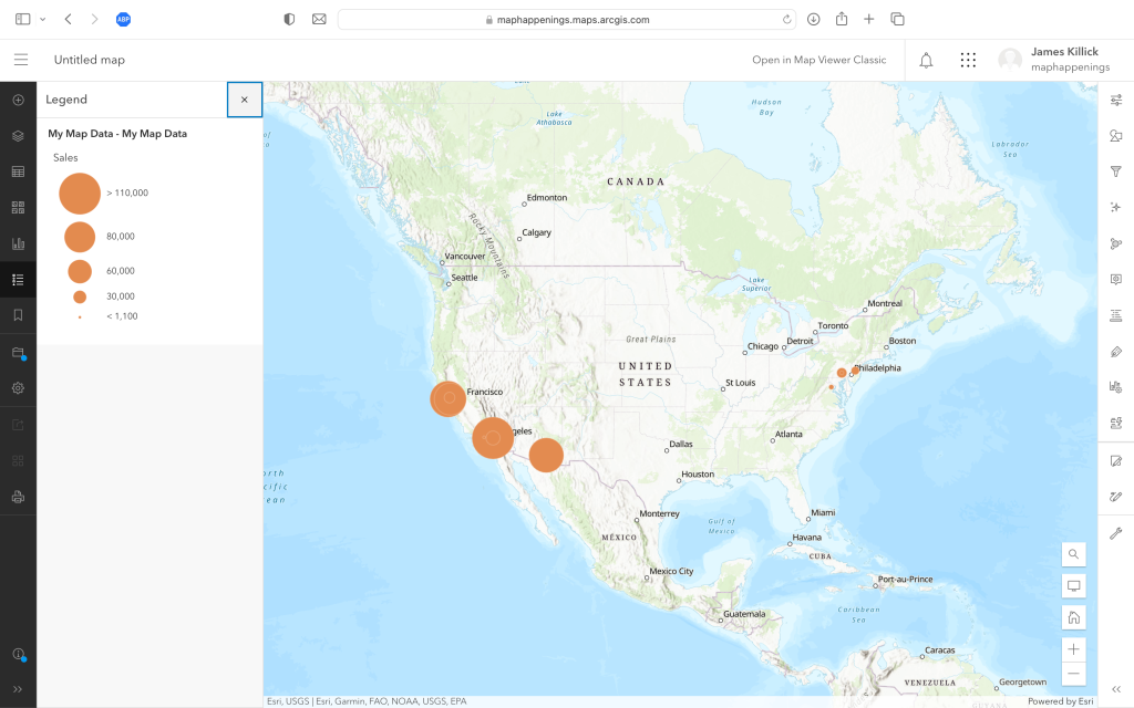
So, similar to Felt, and with not too much gnashing of teeth, I am able to change the map to show different sized circles based on sales volume. But can I solve Part 2 of the Simple Map Happenings Challenge and create a simple color coded map showing sales by state? Please forgive me while I grind away…
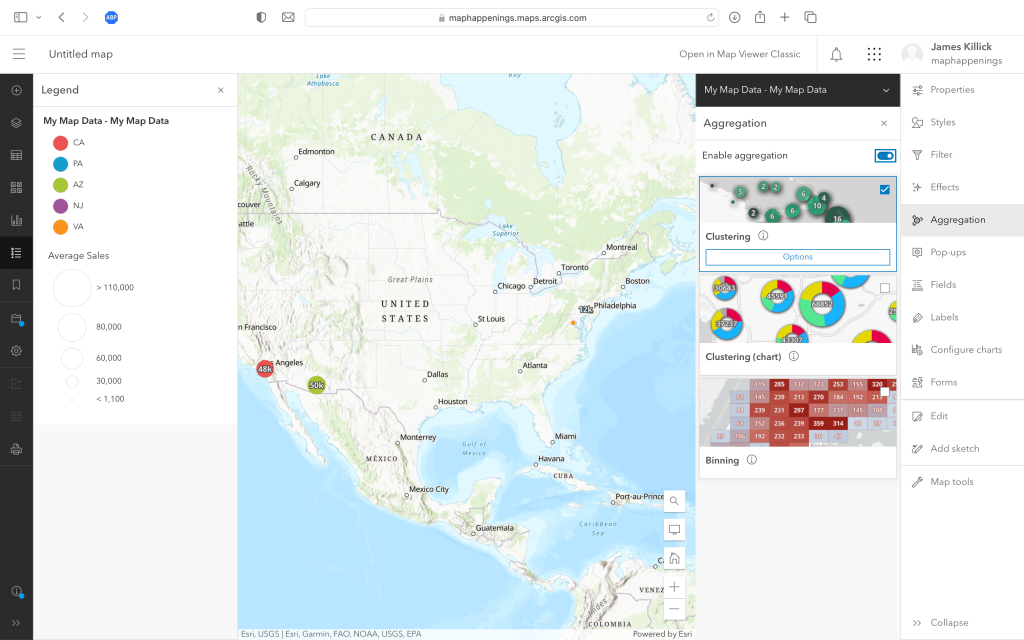
After some relentless clicking, tapping and spelunking I managed to get to the point shown above. Just like with Felt, I know there is most definitely is a way to create color code maps of regions, but frankly I’m stumped. As you can see I’m deep into the dark bowels of Esri technology, having discovered clustering and binning, but not choroplething.
So After All That…
Is there anything else? Well I should give a shout out to the folks at MapIdea. A little like Felt they’re on a mission to make mapping easy, in their case mapping for business analysis use cases. And they show a great video on their web site on how to create maps of sales by region. Here it is:
Sales Performance Analysis using MapIdea – Credit: MapIdea Alas, MapIdea has yet to integrate that nefarious process of geocoding3 into their product, so they can’t solve Part 1 of the Simple Map Happenings Challenge. When they eventually do, they”ll definitely be worth a very close look, ‘cos they’re doing some great work!
If you do some googling you will find some other products that claim to do simple mapping. But the point of today’s post was not to go down that rabbit hole.
No, dear readers, it was to make a very simple point: the big boys and girls — with all that knowledge, history and expertise — still have a lot more work to do.
- Examples include Etak > TeleAtlas/GDT > TomTom, Karlin & Collins > Navigation Technologies > Navteq > HERE, ZENRIN, Google, Apple ↩︎
- Yes, I know, I know. I should have clicked on that thing called “ArcGIS Online – Complete SaaS mapping platform”, but it was that simple term — “Mapping” — that caught my eye and led me down a dead end path. ↩︎
- In layman’s terms: that process of being able to locate a place or an address on a map. ↩︎
-
Places on Google Maps. Can They Still be Trusted?
So as many of you know I’ve been in the mapping business for a little while. Over the years I’ve come to experience many approaches and methodologies to map making. 1
When I embarked on my career at Apple Maps in 2013 I was already an avid Apple fanboy, having had my first exposure to Apple in about 1980 with the Apple ][ 2. So it wasn’t too hard for me to fit into the Apple culture.
![Apple ][ Computer — Image Credit: Computer History Museum](https://maphappenings.files.wordpress.com/2023/08/apple-computer.png?w=1024)
Apple ][ Computer from 1977 — Image Credit: Computer History Museum 2013 was a year after the disastrous Apple Maps launch and the Maps team was hiring like crazy to build a team that not only could build a great map, but build a map that would become the benchmark for everyone else.
Ten years later I’m not sure everyone would agree they’ve achieved the goal, but I think most people who use Apple Maps have appreciated the improvements. To wit, Sam Wolfson’s excellent article recently published in The Guardian: “A decade after a disastrous launch, is Apple Maps finally good?“
But back to my induction to the Apple Maps team in 2013:
Once the IV drip had been inserted and the Kool Aid was flowing I quickly learned the inner workings of Apple’s DNA and how it differed from all the other big tech companies. Much of it stemmed from the fact that Apple did not — and for the most part still does not — rely on advertising to run its business. That gave rise to one of Tim Cook’s most famous quotes about the other guys:
“The end result of all of this is that you are no longer the customer. You are the product.”
Being lumped with the other guys drove people at Apple crazy, particularly when negotiating deals with European organizations. It was particularly bad in France. 3 The French had invented a new acronym: GAFA. GAFA stood for “Google Apple Facebook Amazon” and if you were a member of this group you weren’t to be trusted. You can read more about GAFA in Kabir Chibber‘s 2014 article in Quartz:
In the French press, and for much of the rest of Europe, their innovation is often seen in a less positive light—the ugly Americans coming over with innovative approaches to invading personal privacy or new ways to avoid paying their fair share.
I had my own experience with this when my team was tasked with sourcing floor plans for airport terminal buildings. I won’t forget my first meeting with London Heathrow Airport (LHR). Now I’ll never put the good folks at LHR in the same boat as the French, but let’s just say they still took some convincing.
The conversation went something like this:
Me: “Hey, would you be able to supply us with floor plans of the publicly accessible areas of your terminals so we can provide an insanely great indoor mapping experience for users of Apple Maps?”
LHR (with crossed arms): “No.”
Me: “Perhaps you could tell me why not?”
LHR: “We tried that with Google two years ago.”
Me: “But we’re not Google!”
LHR (still with crossed arms): “Well Google allows anyone to add places to their map. Because of that we have unlicensed taxi companies claiming to provide official taxi services right in the middle of our concourse. That’s a real problem for us. We can’t let you do that too.”
Upon that I was shown a Google map of LHR Terminal 5 with an icon for “Bob’s Taxis” right there in the middle of the arrivals area. Not good.
I am pleased to say our negotiations with the friendly chaps at LHR got there eventually and now Apple Maps users have the pleasure of using indoor maps in many airports around the world, including LHR:
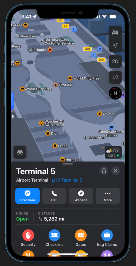
Credit: Apple Meanwhile here’s LHR in Google Maps:
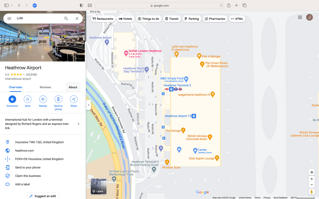
Credit: Google And if you zoom in a bit:
Credit: Google Yes, dear readers, the dreaded unlicensed taxi cab service is still there. It’s no longer called “Bob’s Taxis” and it now sounds a lot more official, but hey — I pity the poor passengers that fall for this.
It doesn’t stop there.
A very good friend of mine was surprised to find that photos of NASCAR like race cars — which judging by his Vermont cultivated demographics he would never own — were now associated with his home address on Google Maps! He doesn’t know who put them there, but only through a sternly worded note did he finally manage to convince the good people at Google to take the photos down.
But it gets worse. Much worse.
Take this recent story from Shmuli Evers on Twit…, err, I mean ‘X’:
It turned out this number wasn’t Delta’s number at all. When the supposed Delta Airlines rep started asking him to confirm information by texting a different number he began to get suspicious. He asked them where they were located. They said “Rochester NY”. He asked them “Where is Rochester?”. They said “2 hours south of NY”.4 That was the red flag that did it. Google had a scam number listed as the official number for Delta airlines.
Shmuli did some more checking. Delta wasn’t alone. Google had scam numbers listed for many other airlines at JFK and LaGuardia:
If you want the read the whole thread I suggest you start here:
Tweet by Shmuli Evers on the Scam Phone Numbers for Airlines in Google Maps Needless to say since Shmuli discovered this problem about three weeks ago Google seems to have resolved the issue. But shit, how did this happen?
It looks like the scammers simply dropped some new places on Google Maps simply by using the ‘Add a missing place’ / ‘Add your business’ feature of the product. 5
Is this still possible?
Well just for giggles I tried it today and attempted to add ”Barry’s Nail Salon” to Google Maps. Sure enough within the hour I got this message from the nice folks at Google:
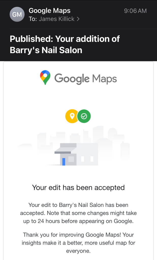
Credit: Google Add just a few hours later it appeared in its full glory on Google Maps:
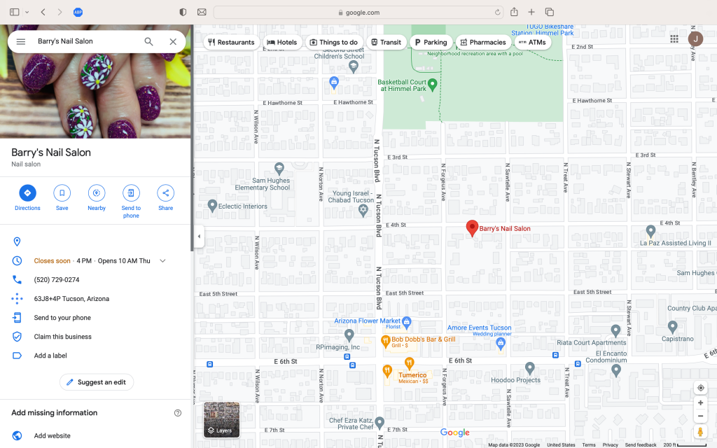
So what’s the deal here?
I think it is a text book example of the main difference in DNA between Google and Apple:
- Google is all about crowdsourcing.
- Apple is all about curation.
Does the same kind of scamming happen on Apple Maps? I’ve not heard that it does.
Are places on Apple Maps infallible? Lord god, no, absolutely not. They’re OK in some regions of the globe, but in others they still suck.
But given this ease of spamming it still brings up the question: can Places on Google Maps still be trusted?
1 See “OK Map Making Nerds — Where’s Your Revolution?“
2 Around the same time I was also an avid Sinclair fanboy and the proud owner (and programmer) of a Sinclair ZX Spectrum, but that’s a whole other story!
Sinclair ZX Spectrum — Image Credit: Wikimedia 3 Who would have thought?!
4 It ain’t. Even on Google Maps.
5 In your browser simply right click on any location in Google Maps and this menu will pop up:
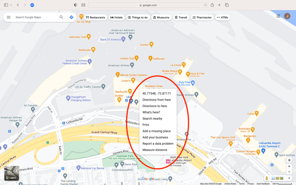
Credit: Google
